Apres Diem Menu Update
menu design update–Spring/Summer 2016
Open for more than 15+ years, Apres Diem has been a Midtown favorite for an eclectic mix of patrons and followers. They offer service from lunch through dinner and late night, with weekend brunch and specialty coffees and desserts.
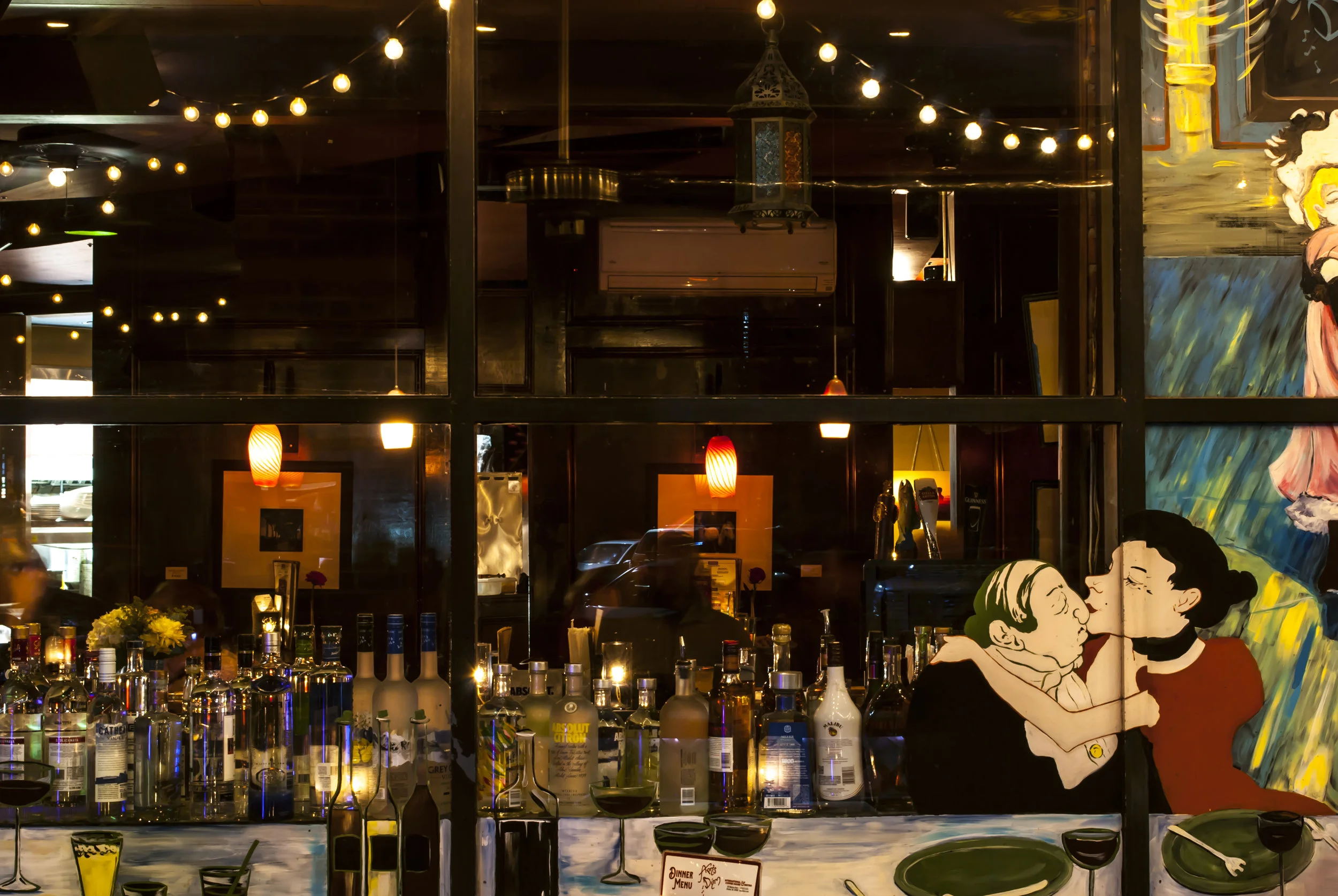
Atmosphere
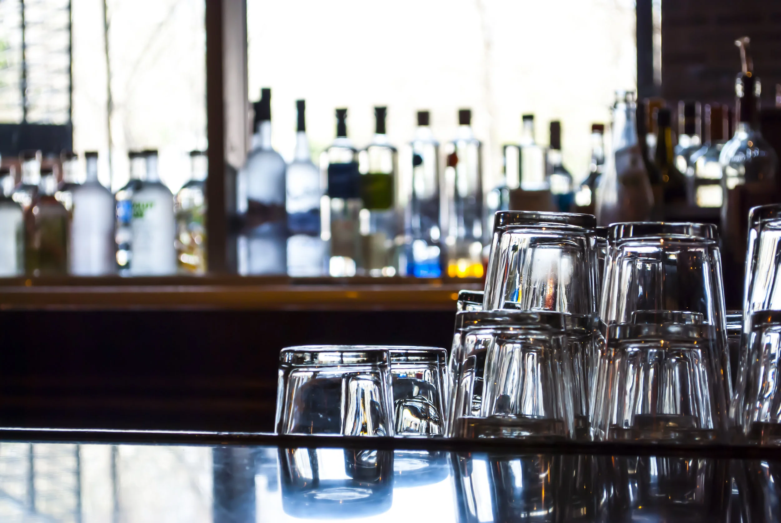
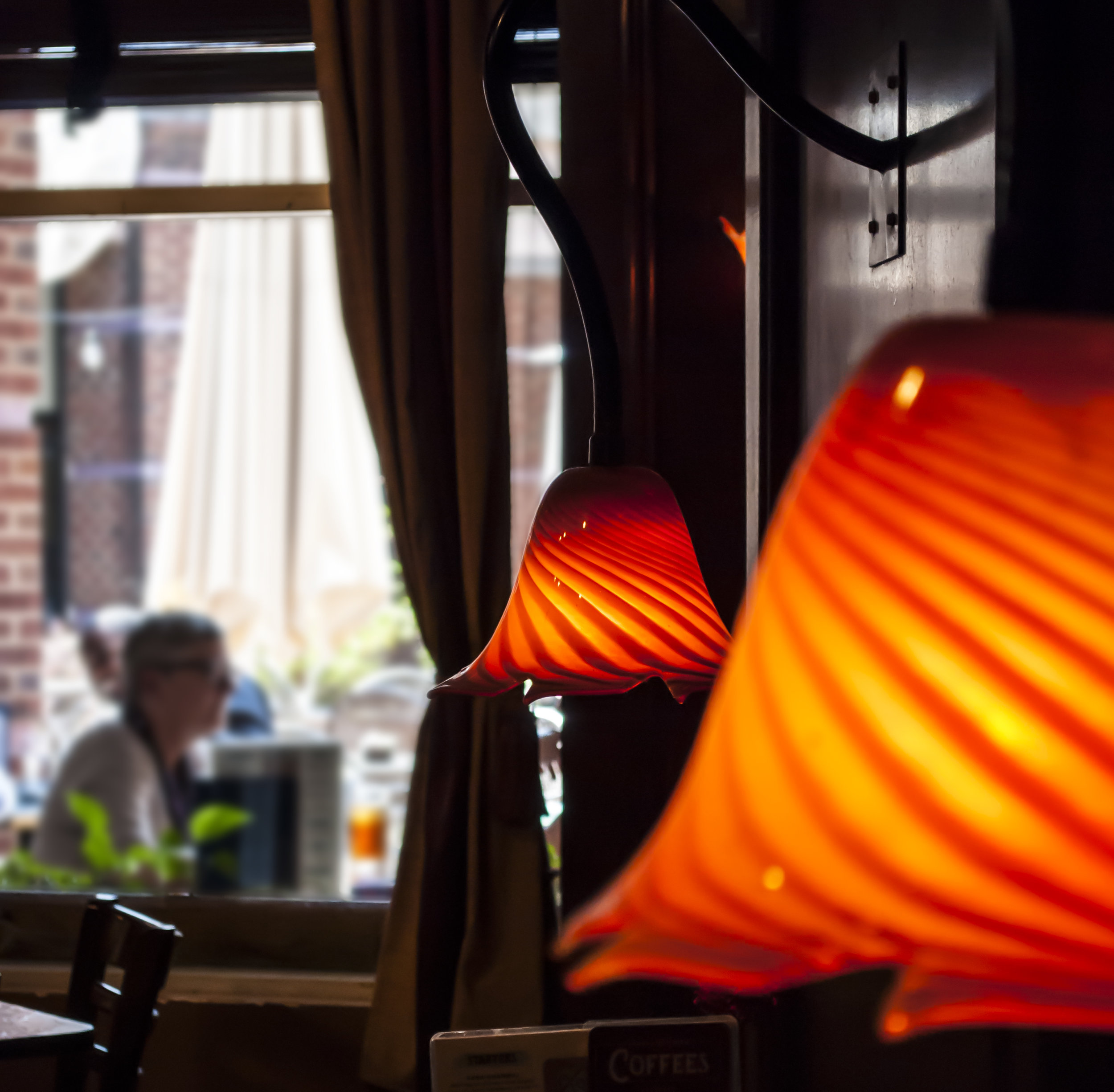
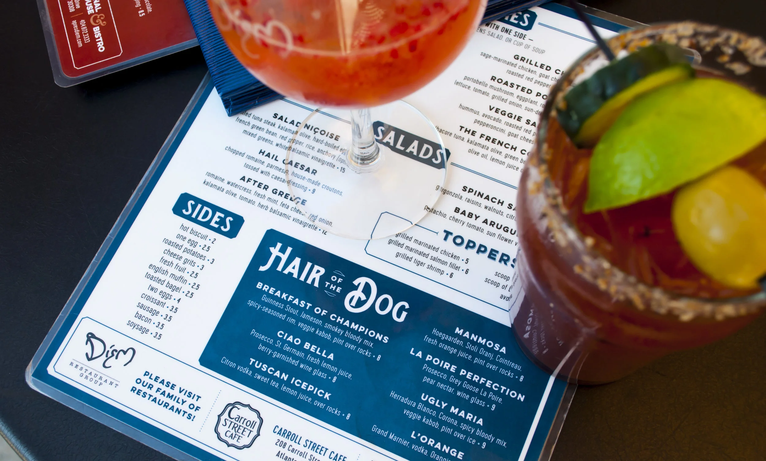
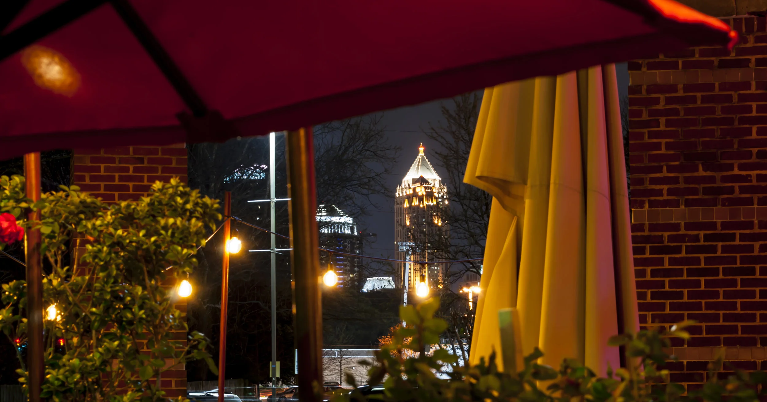
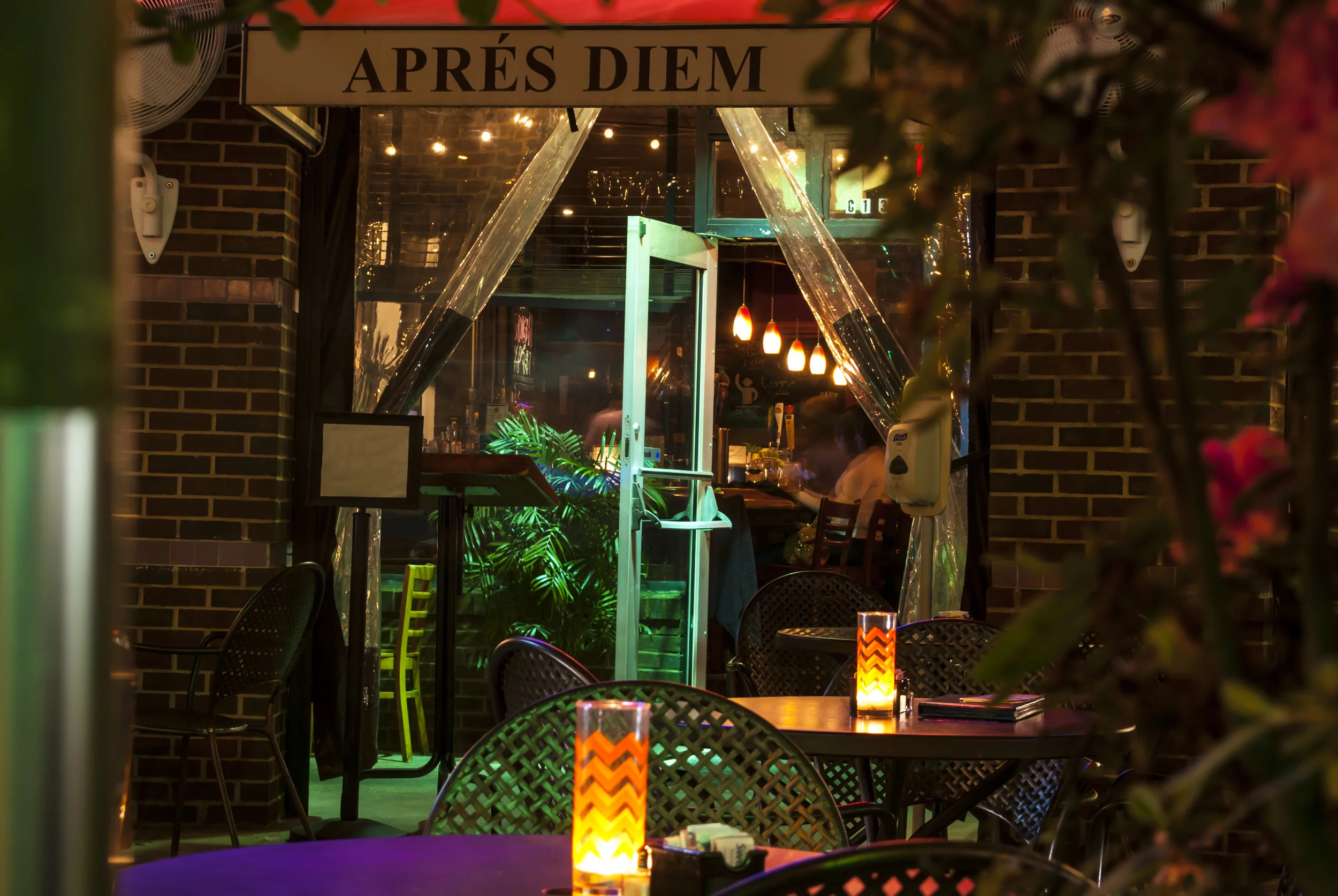
The opportunity for a menu redesign presented a unique challenge in that a specific personality for the venue needed to be established and communicated. The goal was to develop a system of typesetting and layout that complemented the interior/exterior personality, and didn't attempt to follow trends or position the restaurant as something that it was not. Apres Diem has a large base of customers from a diverse range of cities and countries across the globe, so this international yet collective vibe needed to be expressed through a system of clean and considered menus.
Typography
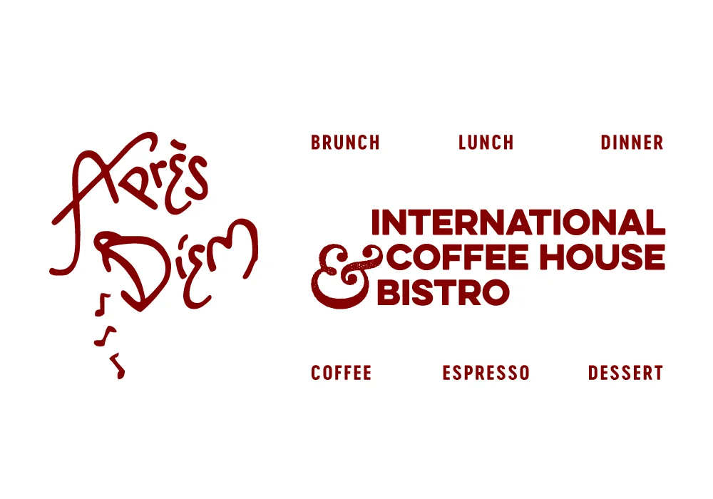
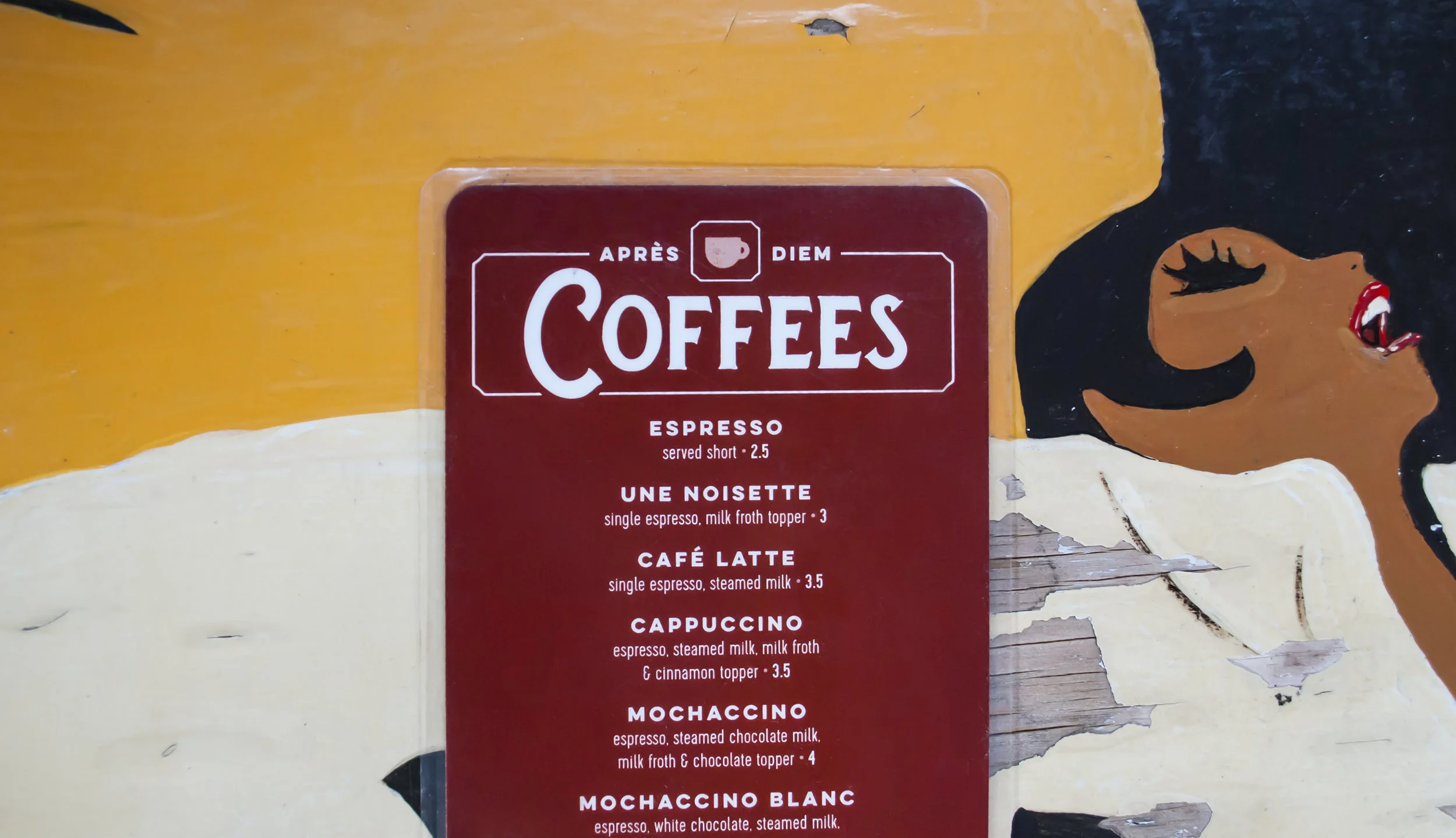
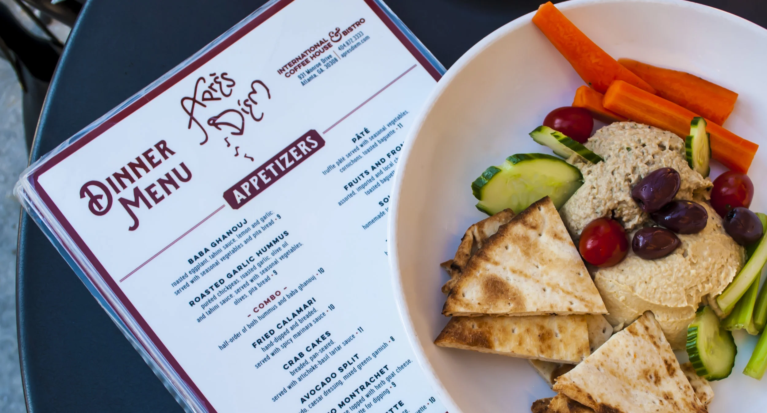
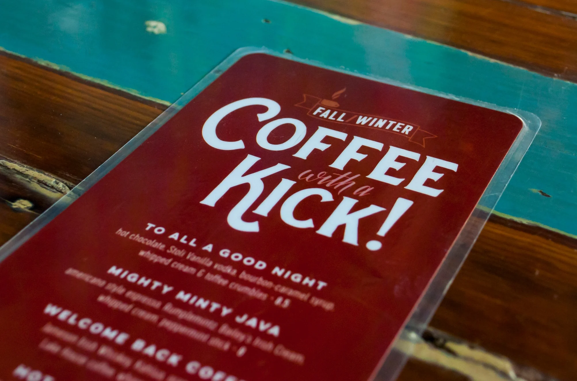
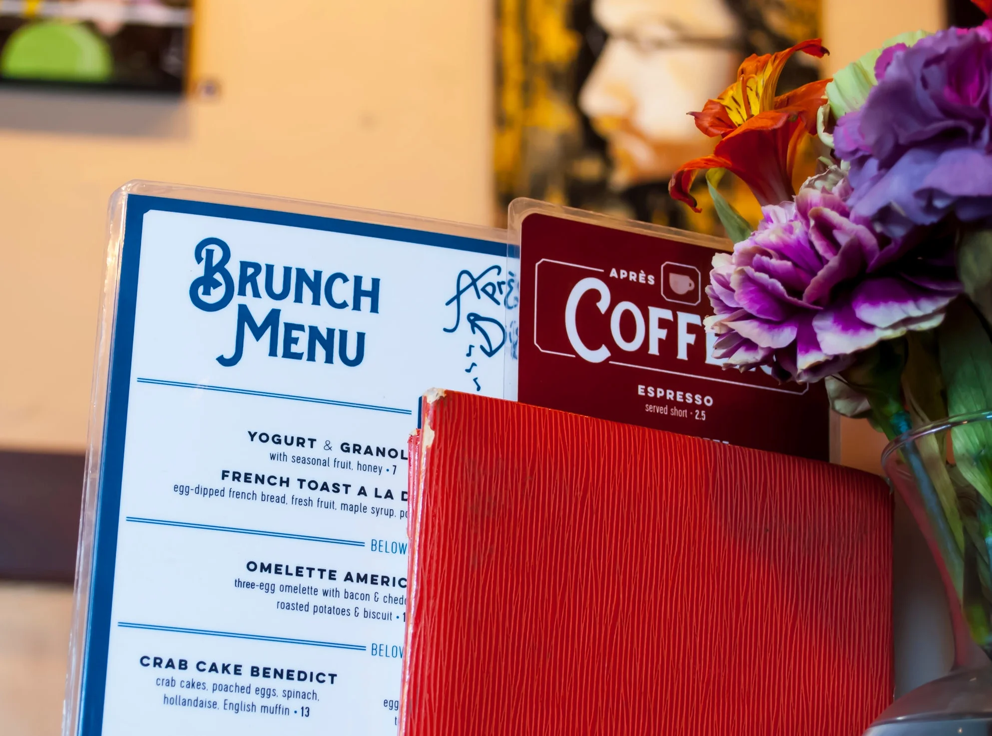
Avoiding any distressed or overly decorative/stylized fonts was the primary objective with developing a voice for the menus; Splandor features a hand-painted, vintage sign quality that echoes the European vibe of the food and atmosphere. Eveleth and Cervo serve to contrast and complement one another, the former for it's weight and width, and the latter for setting large amounts of descriptive copy.
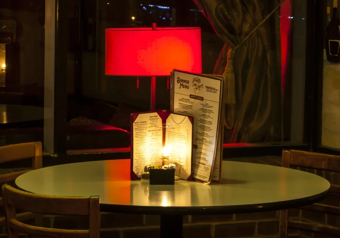
Consideration for sizing and legibility in evening and late night settings was also key, as the coffee and dinner menus would in most scenarios be read in dim lighting or candle light.
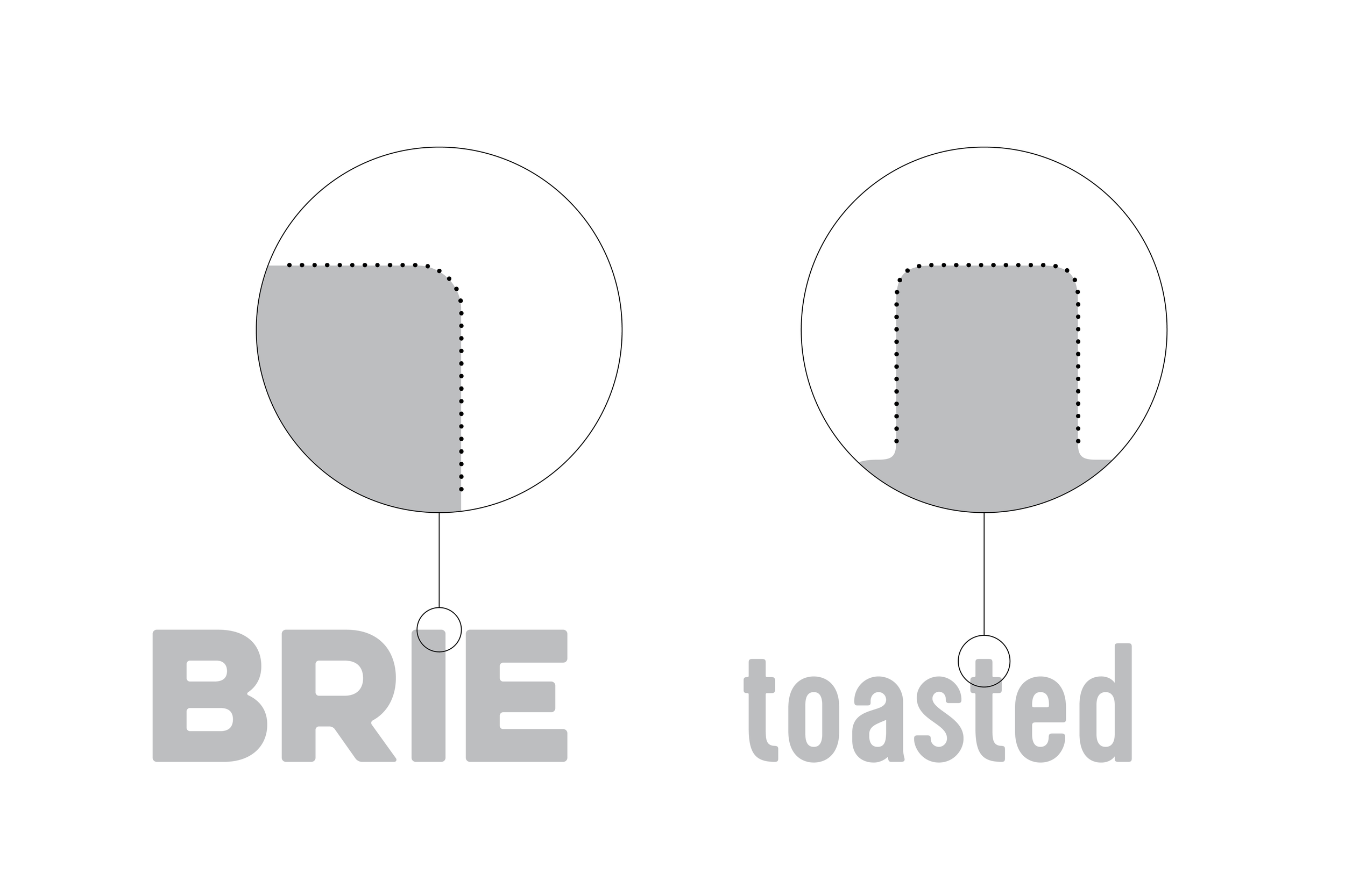
Another subtle feature of the header and body type is their rounded corners, which lets them complement one another while still maintaining a striking contrast in weight and width.
