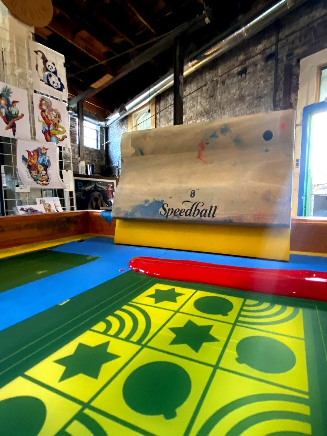
The studio acts as a place for experimentation and testing ideas. Sometimes the best way to see if something works is to make it yourself.
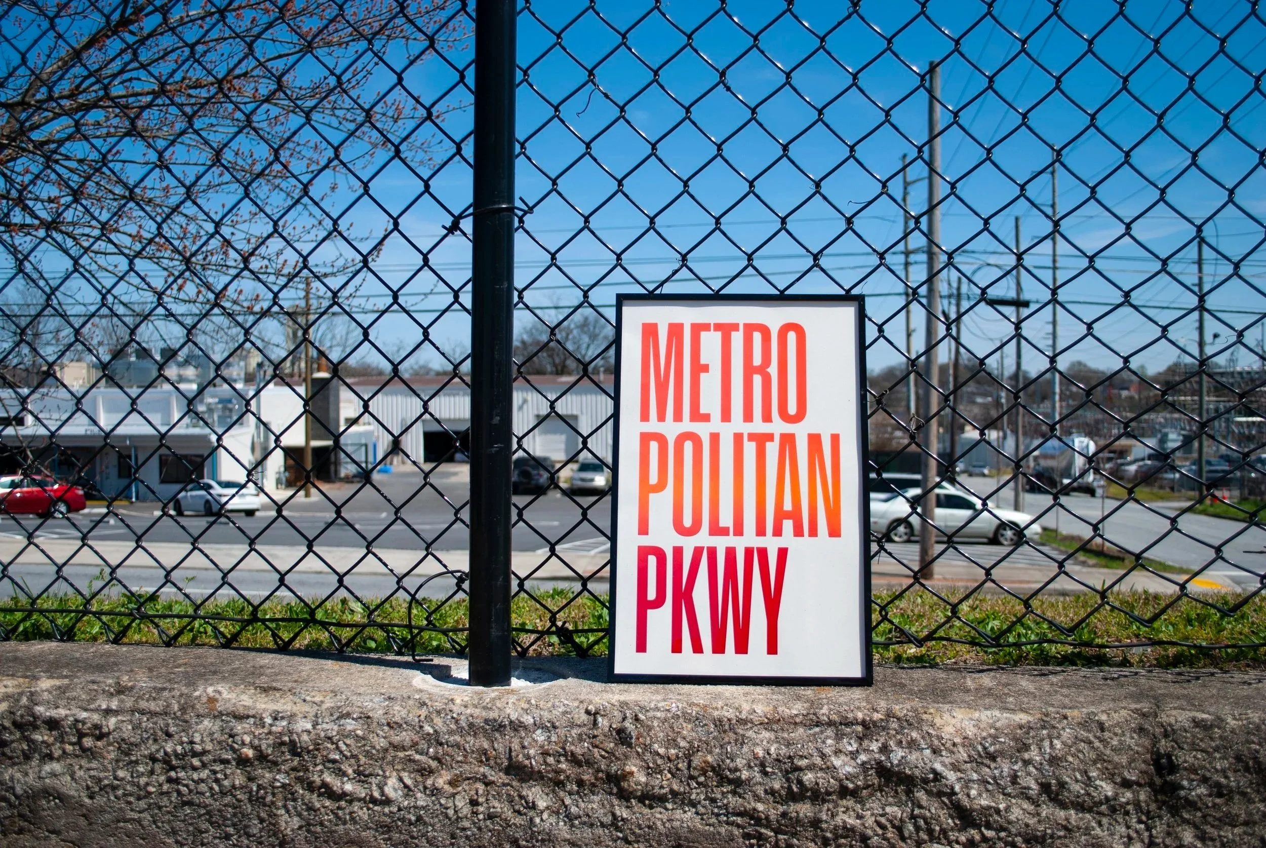
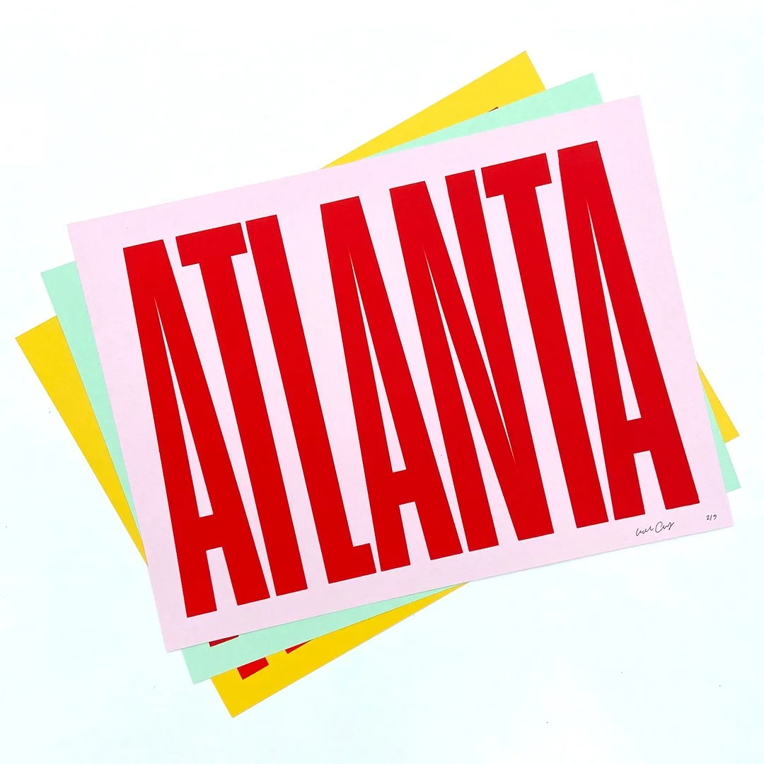
Collaboration with Press Shop Summerhill, screen printed poster series of Atlanta streets
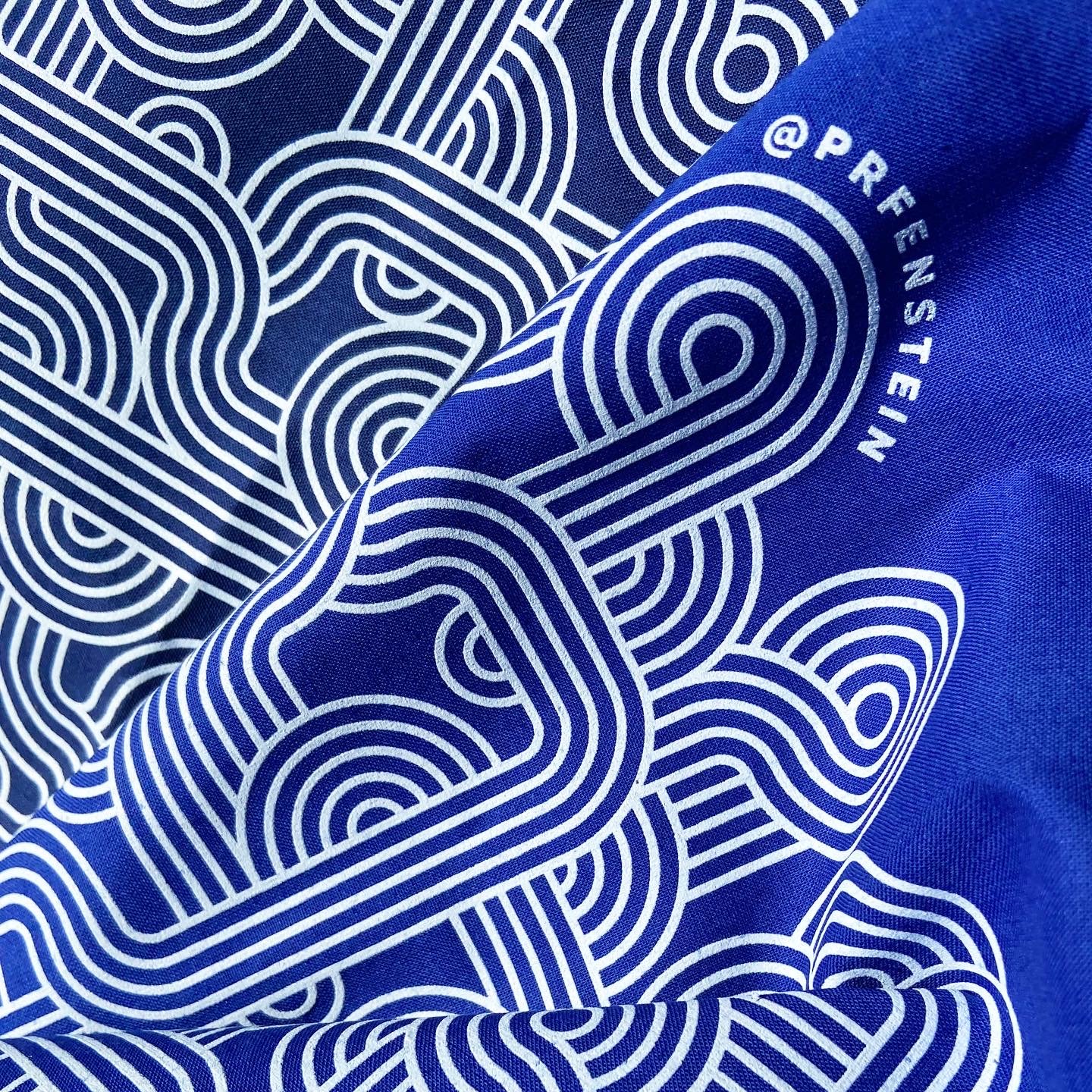
Illustrated pattern for bandanas, self-directed merch design
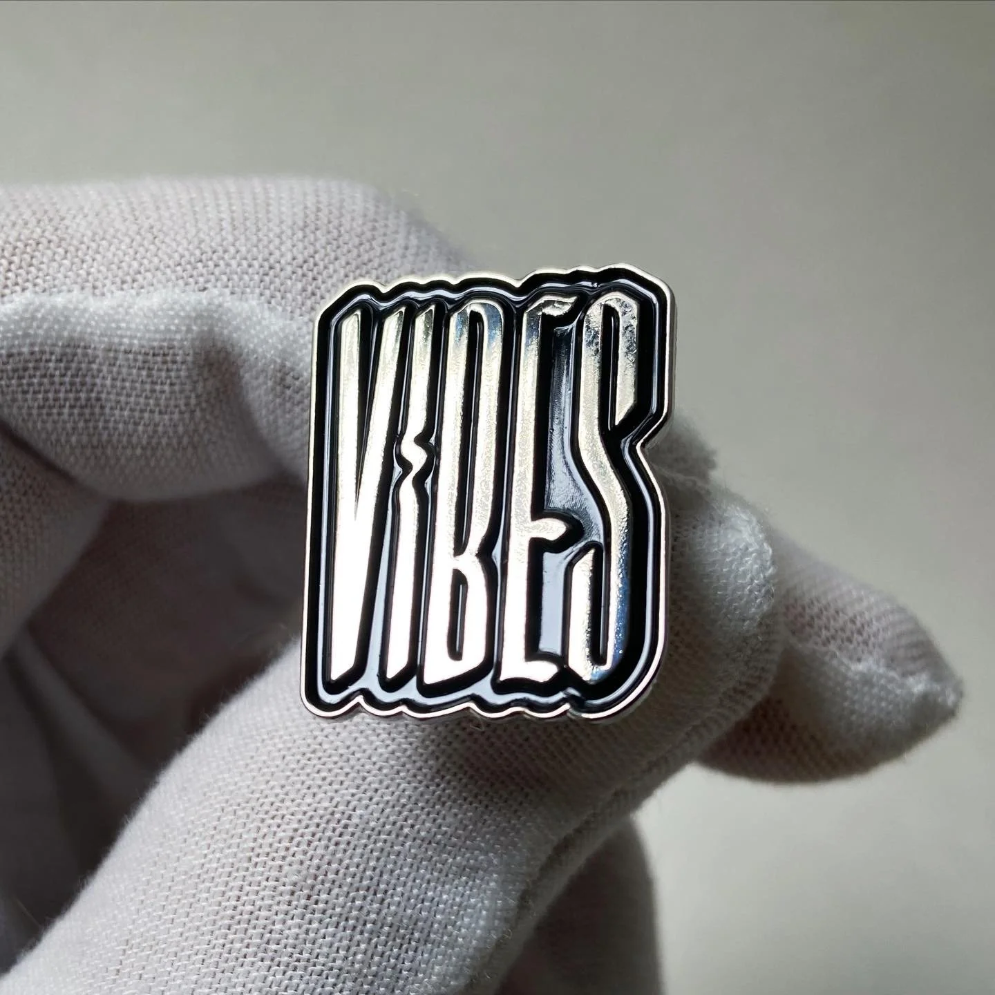
Enamel pins featuring independent type designers
Live screen printing, holiday cards 2025
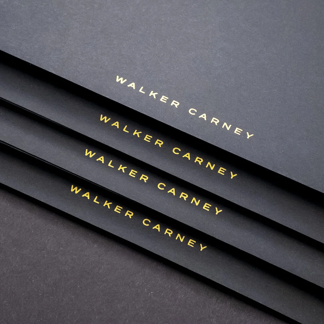
Foil-stamped stationery for client gifts
Screen printed typographic prints
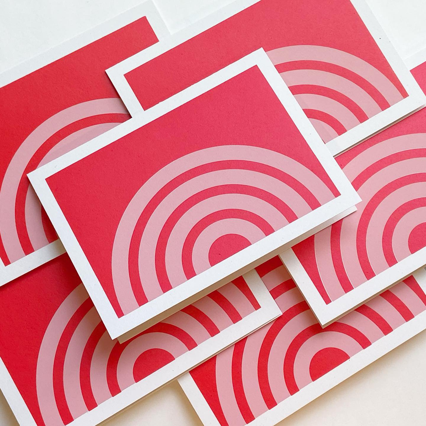
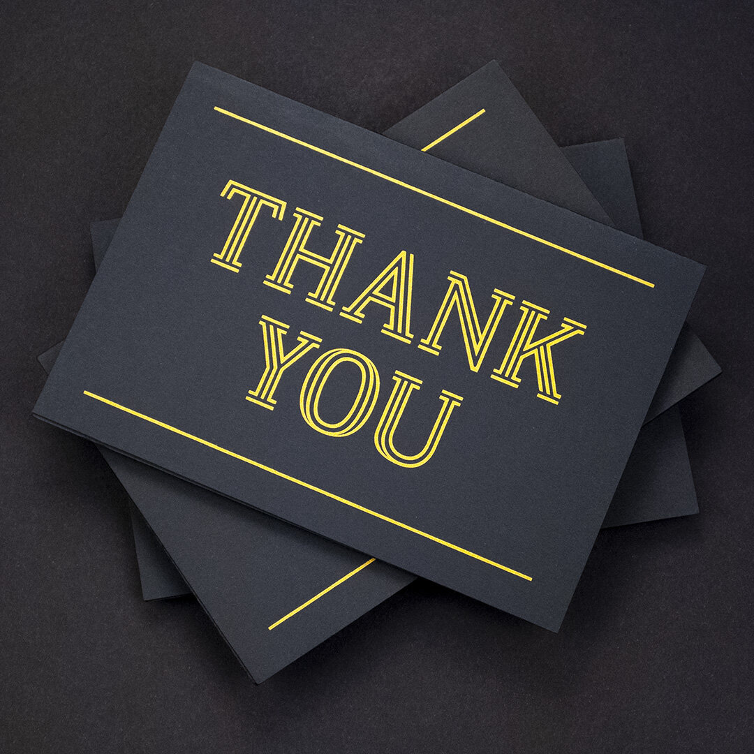
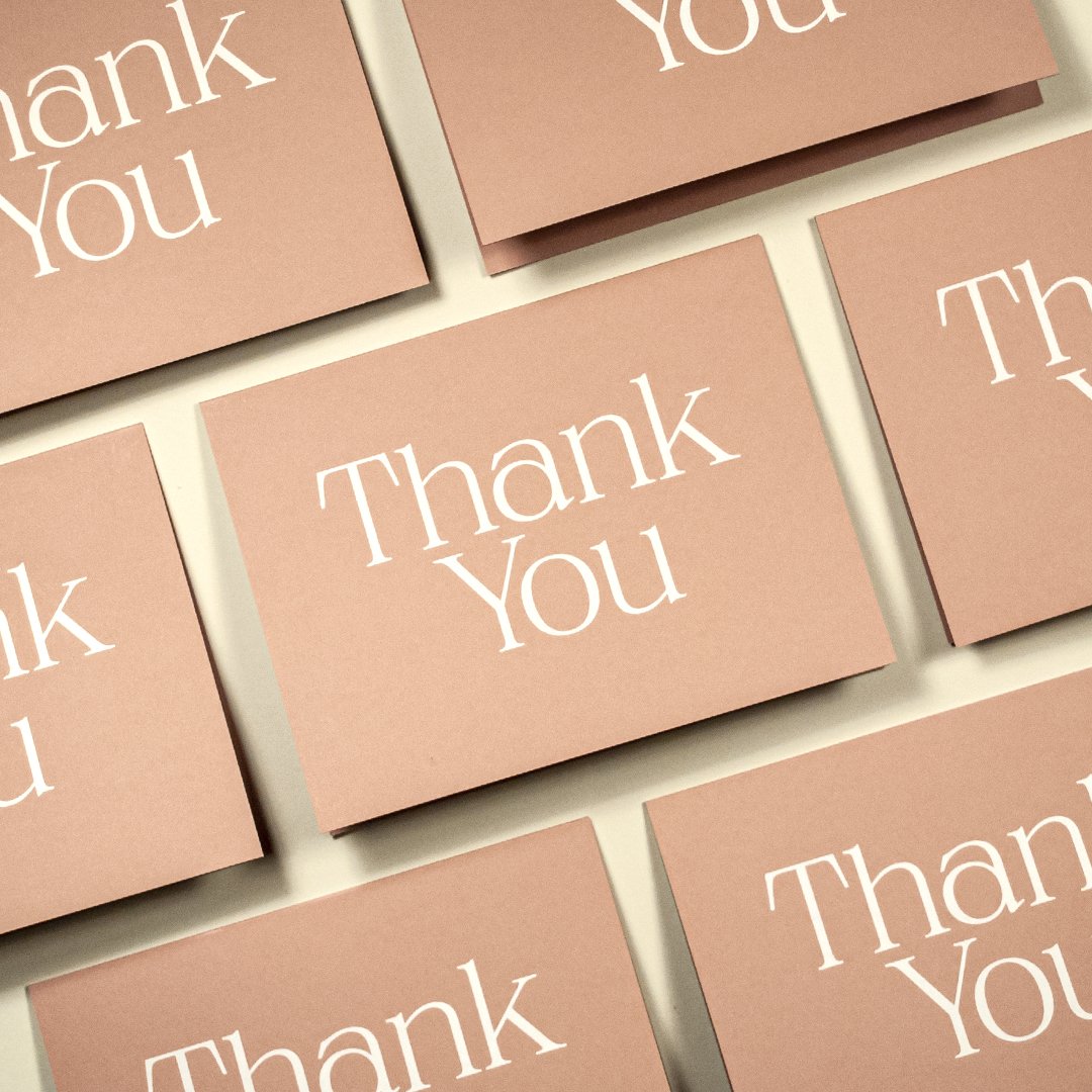
Hand-printed 5x7 folding cards
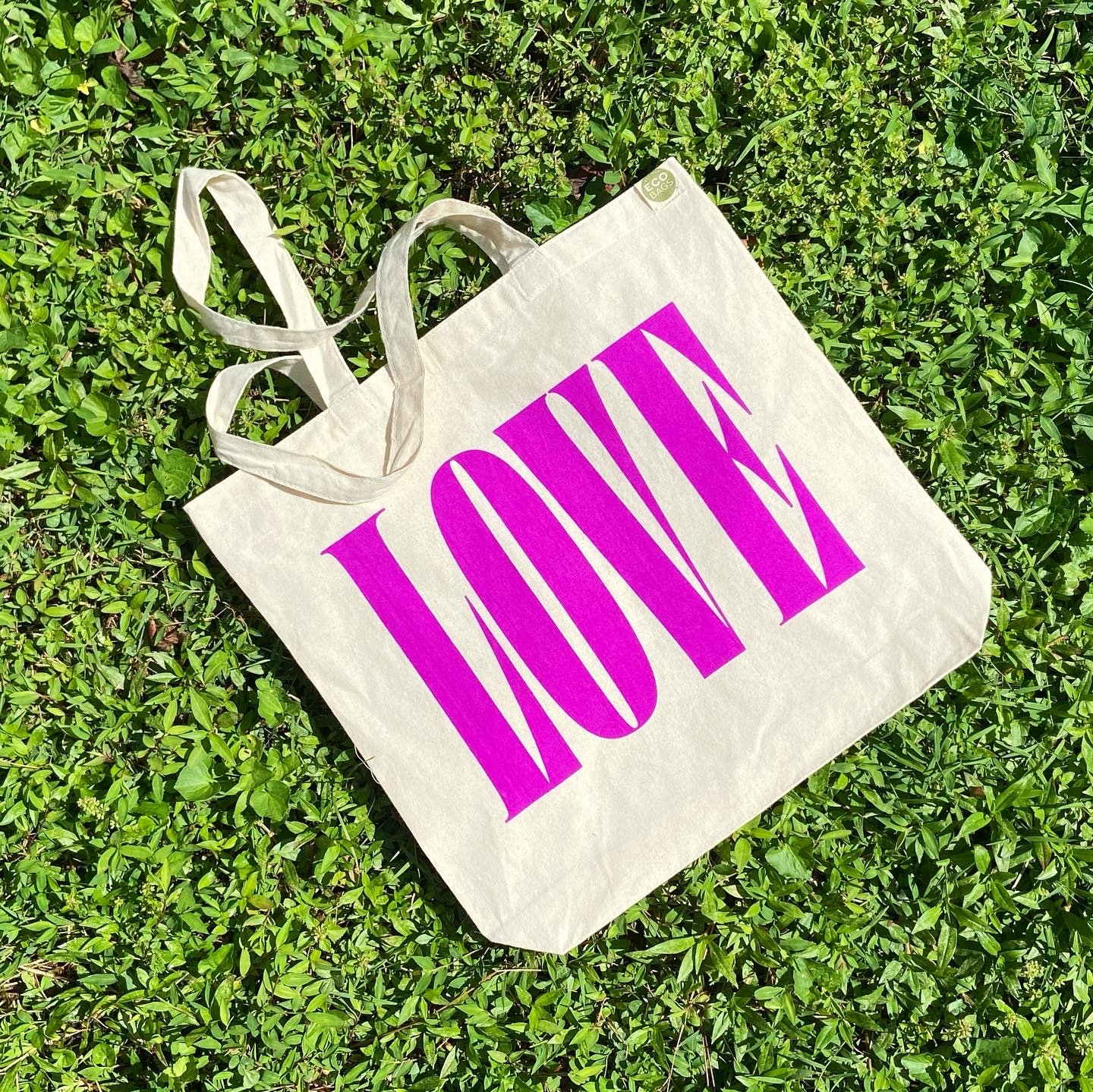
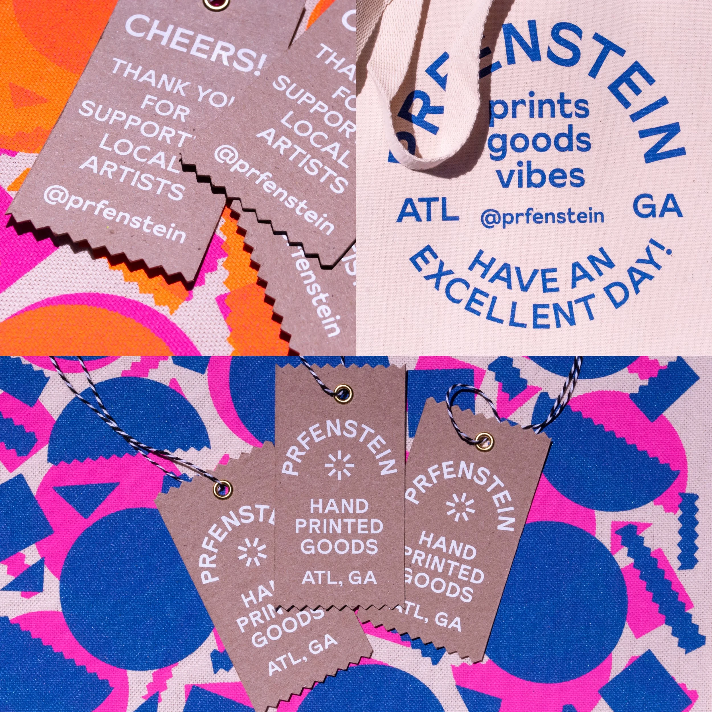
Hand-printed typographic tote bag
In addition to client work, I enjoy pursuing various methods of printmaking and object design. Many of these processes have their place within a branded ecosystem, and finding new and unexpected ways to create physical artifacts always yields surprising and beautiful results.
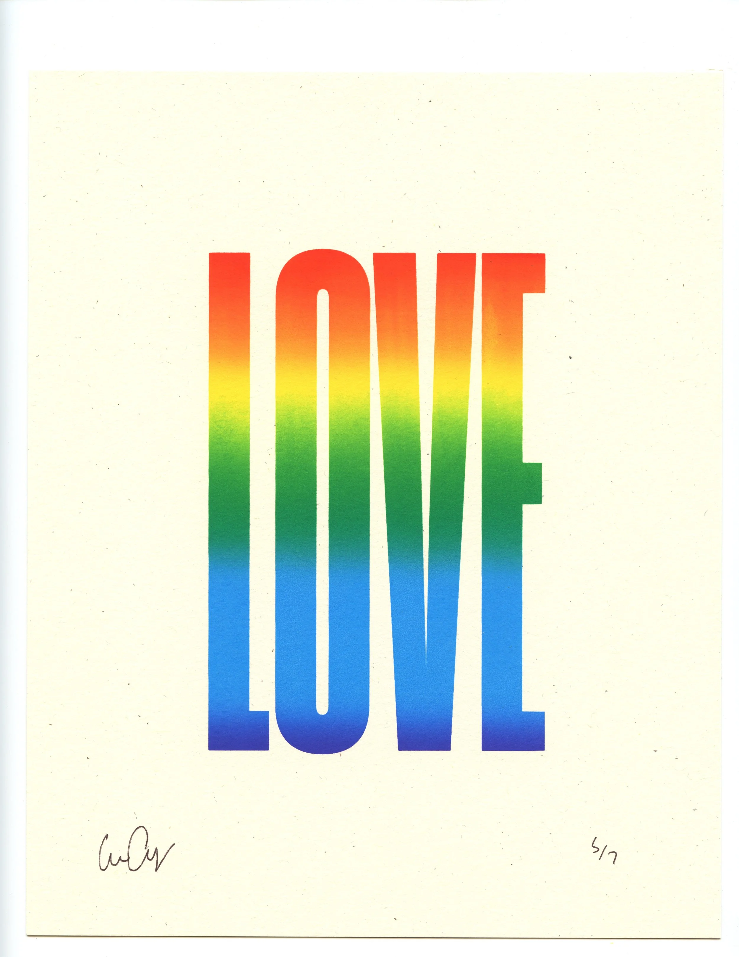
A celebration of type
I am constantly collecting type families from independent designers around the world. I believe that looking beyond standard font servers (e.g. Google fonts) is a way to keep the practice thriving and support those who craft the tools we use daily. Printing layered fonts physically with serigraphy will always be satisfying to me, and knowing that I am giving back to the design industry by licensing these typefaces reinforces the community aspect of creativity.
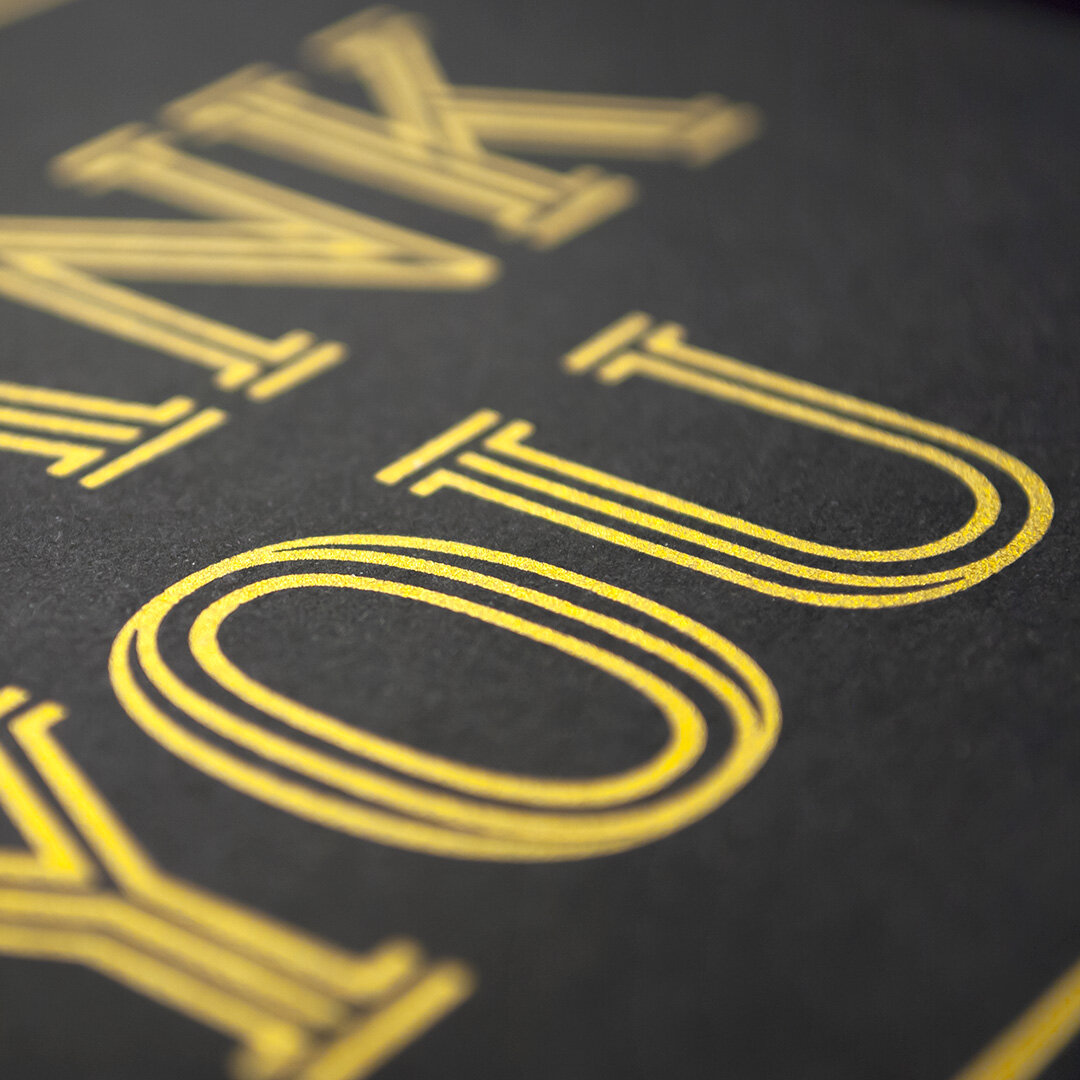
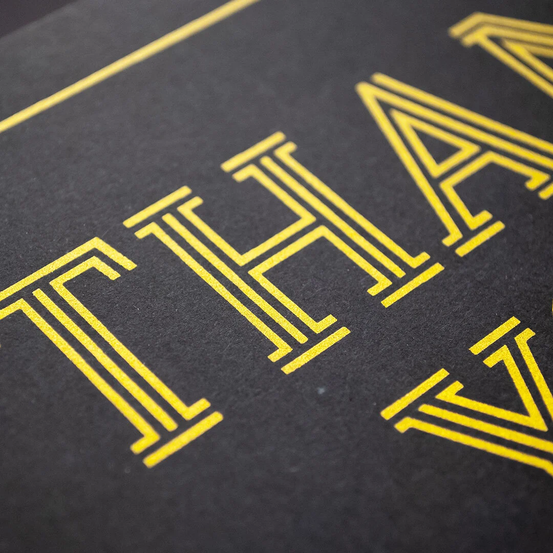
This series of mini-prints utilizes Frontage Condensed by type designer Juri Zaech (CA, USA)
“Walker has a bold, straightforward way of working with type — simple statements, strong colors, and confident compositions. I love how he used my Frontage Condensed thoughtfully in his screen printing, in a way that feels intentional and full of personality. It’s always encouraging to see designers who genuinely value independent type.”
— Juri Zaech, Art Director and Type Designer, Founder of Juri Zaech Studio
These classic Atlanta tees are hand-printed on mint shirts with Permaset Aqua fluorescent inks, featuring Coign by the Colophon foundry.
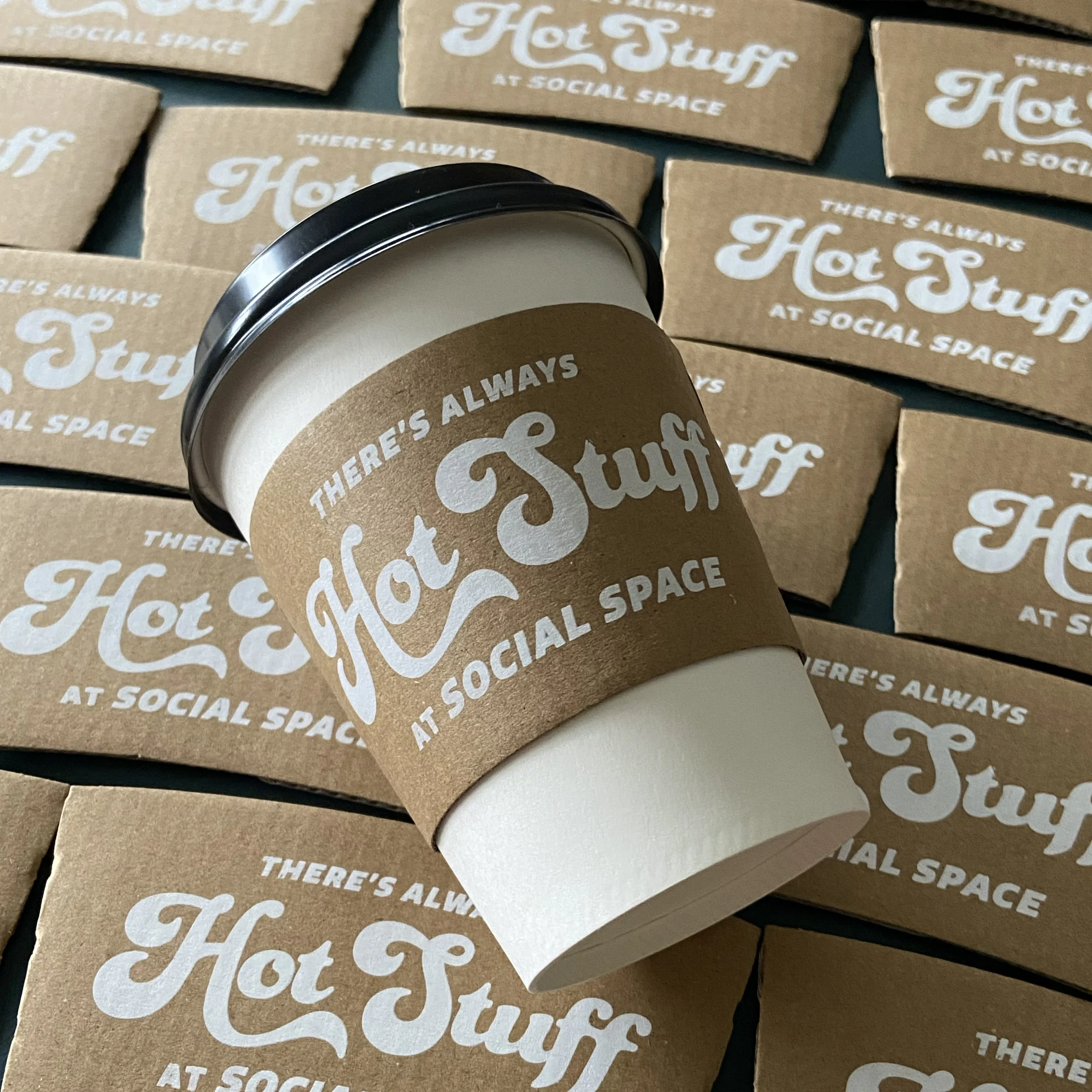
I will print on literally anything, from easy substrates like cotton and paper all the way to corrugated cup sleeves, wood panels and glass.
Pursuing my own projects has led to some wonderful partnerships and collaborations.
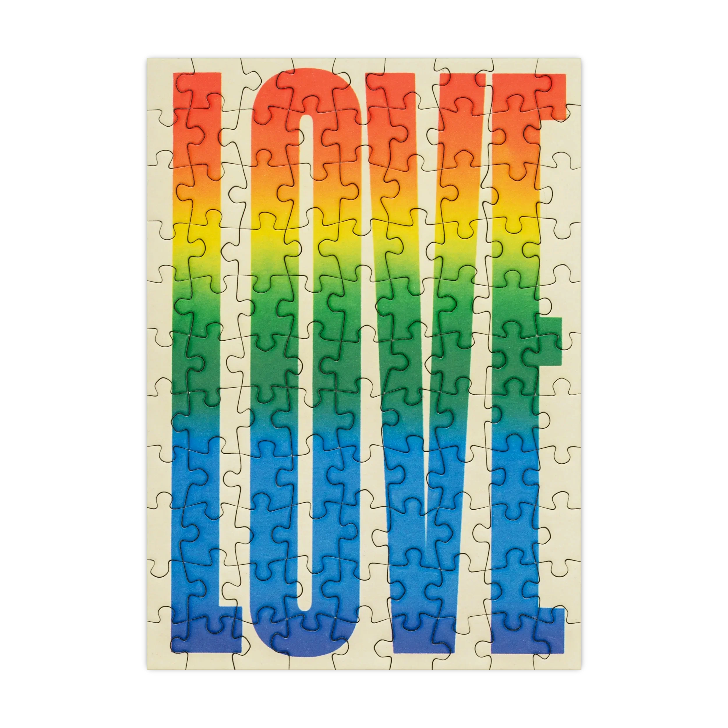
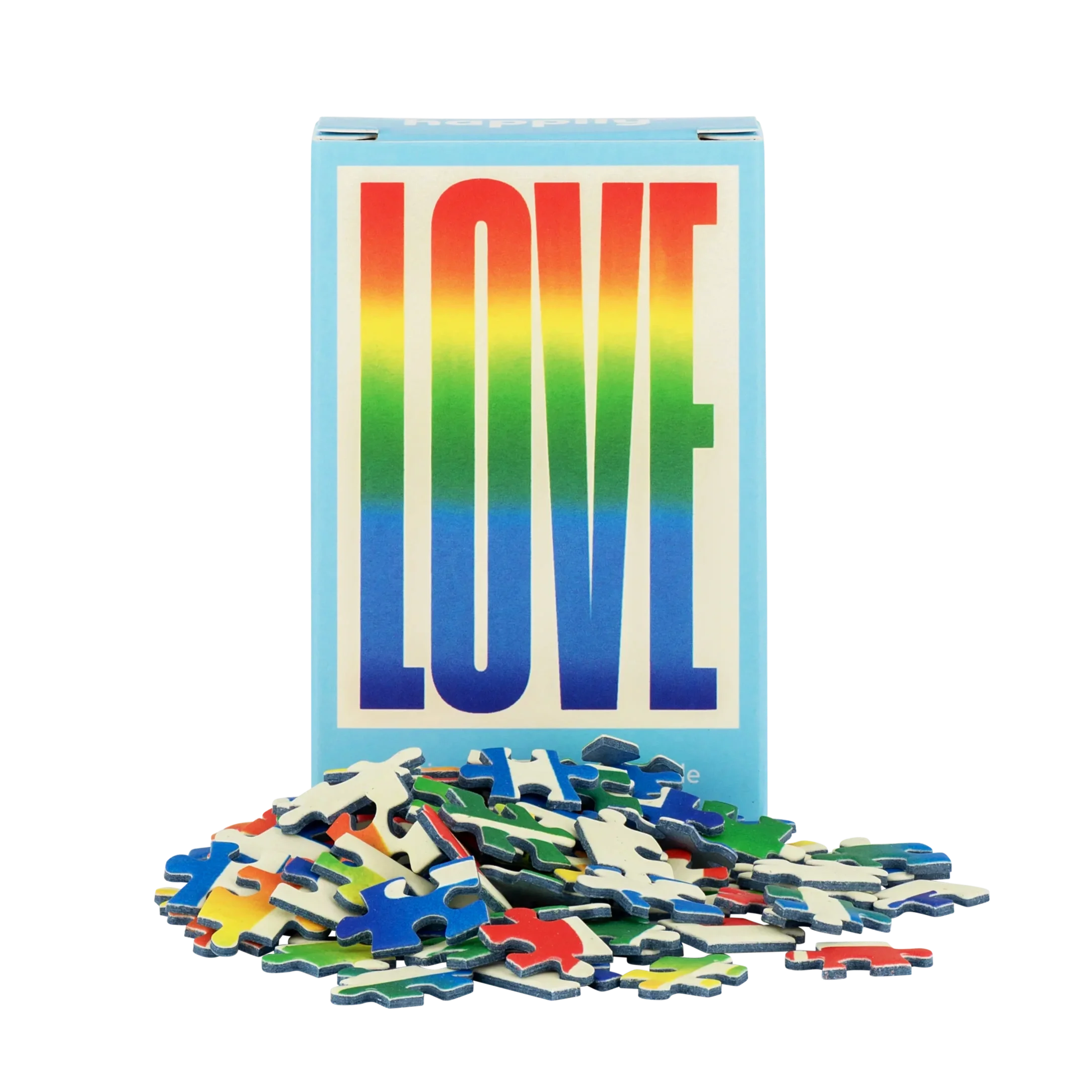
A series of multi-colored prints was selected by Happily Puzzles in the UK for a limited edition release as a mini puzzle set.
Live screen printing
Fall 2025
I’ve had the opportunity to work with local businesses like The Victorian to host live printing Q&As and special event collaborations. Most recently we worked on a set of exclusive holiday cards for their locations in East Atlanta and Old Fourth Ward, printed live in their beautiful space along the Atlanta Beltline.
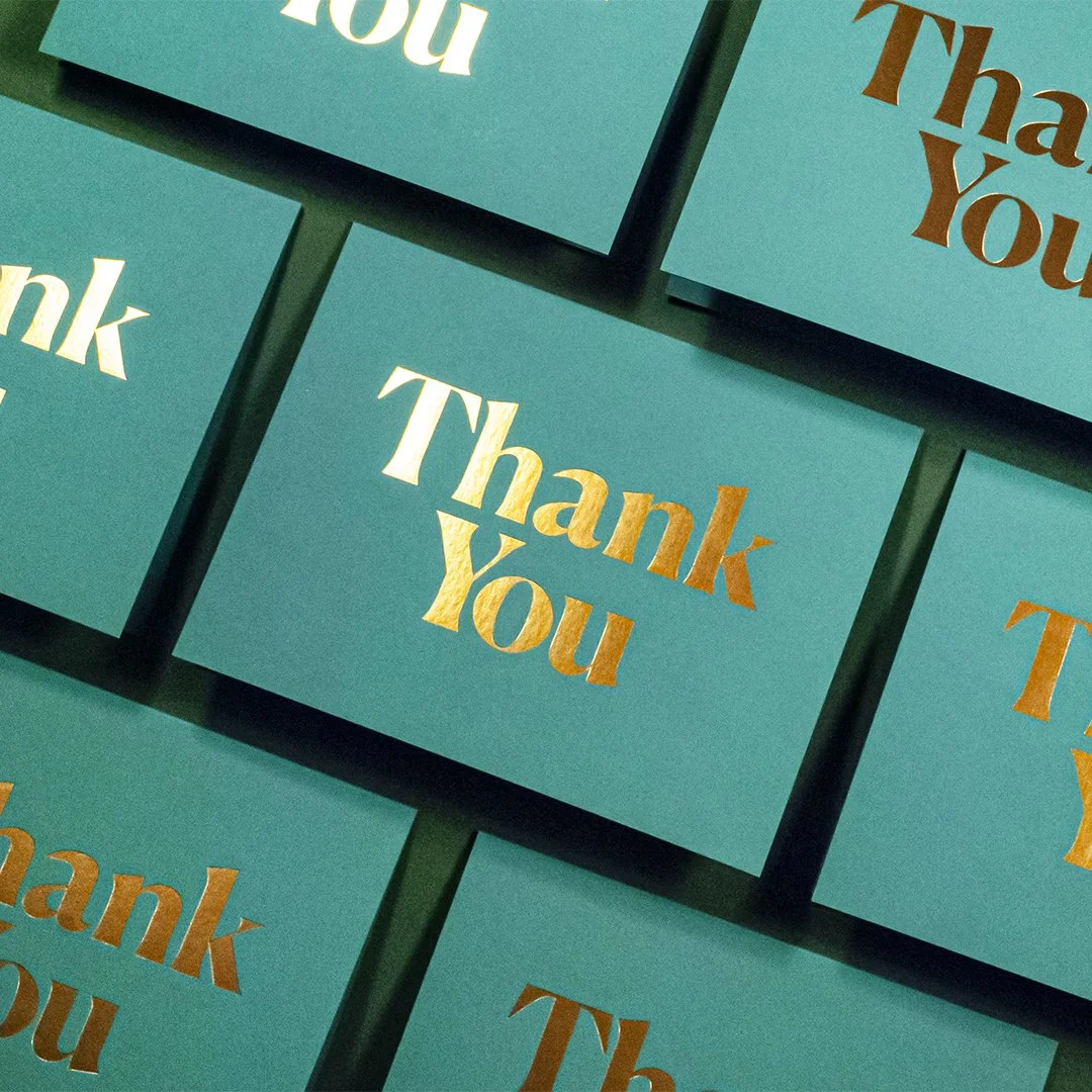
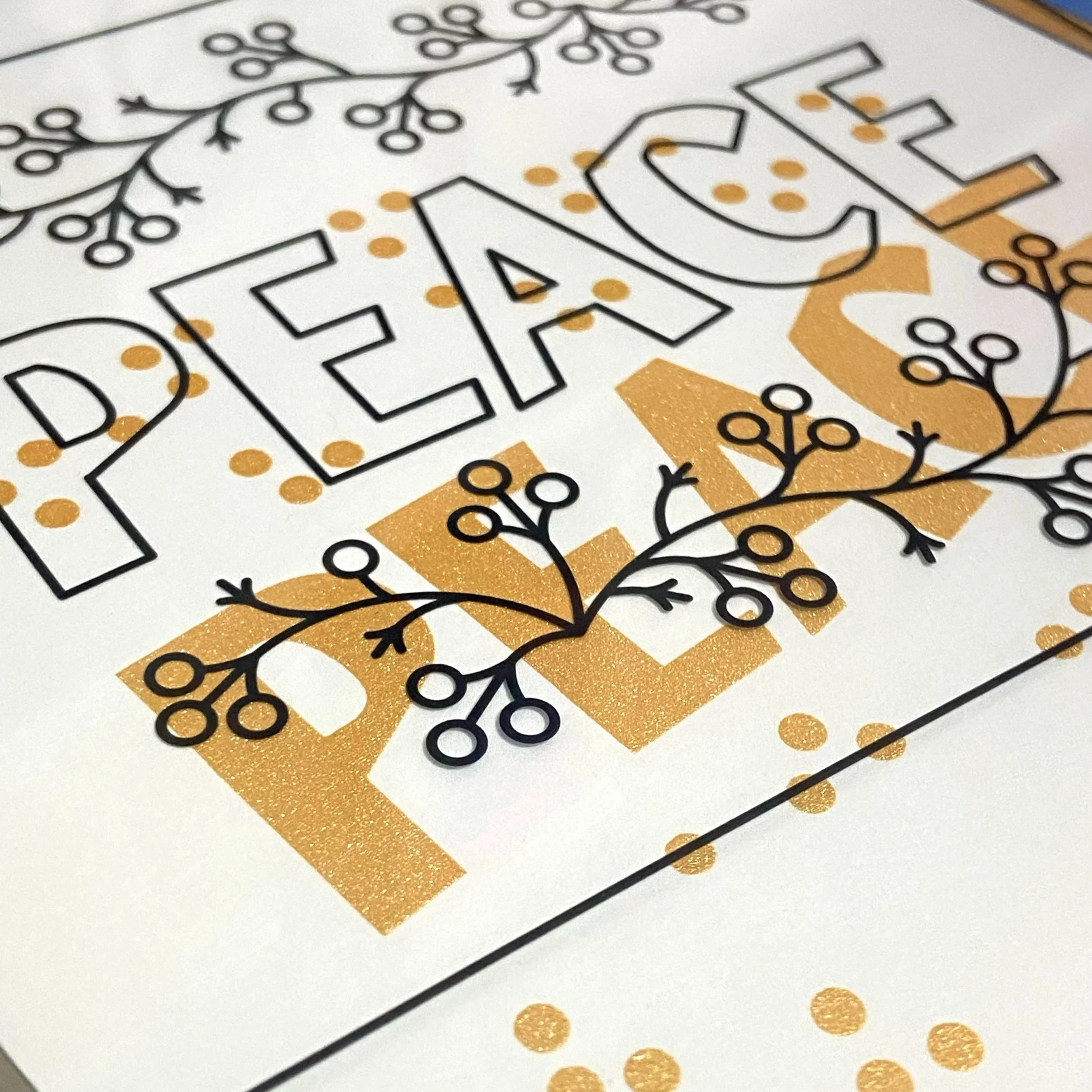
Each card started with a layer of bright gold ink, printed the night prior, before being finished in-house with the dark green details and sold in-store.
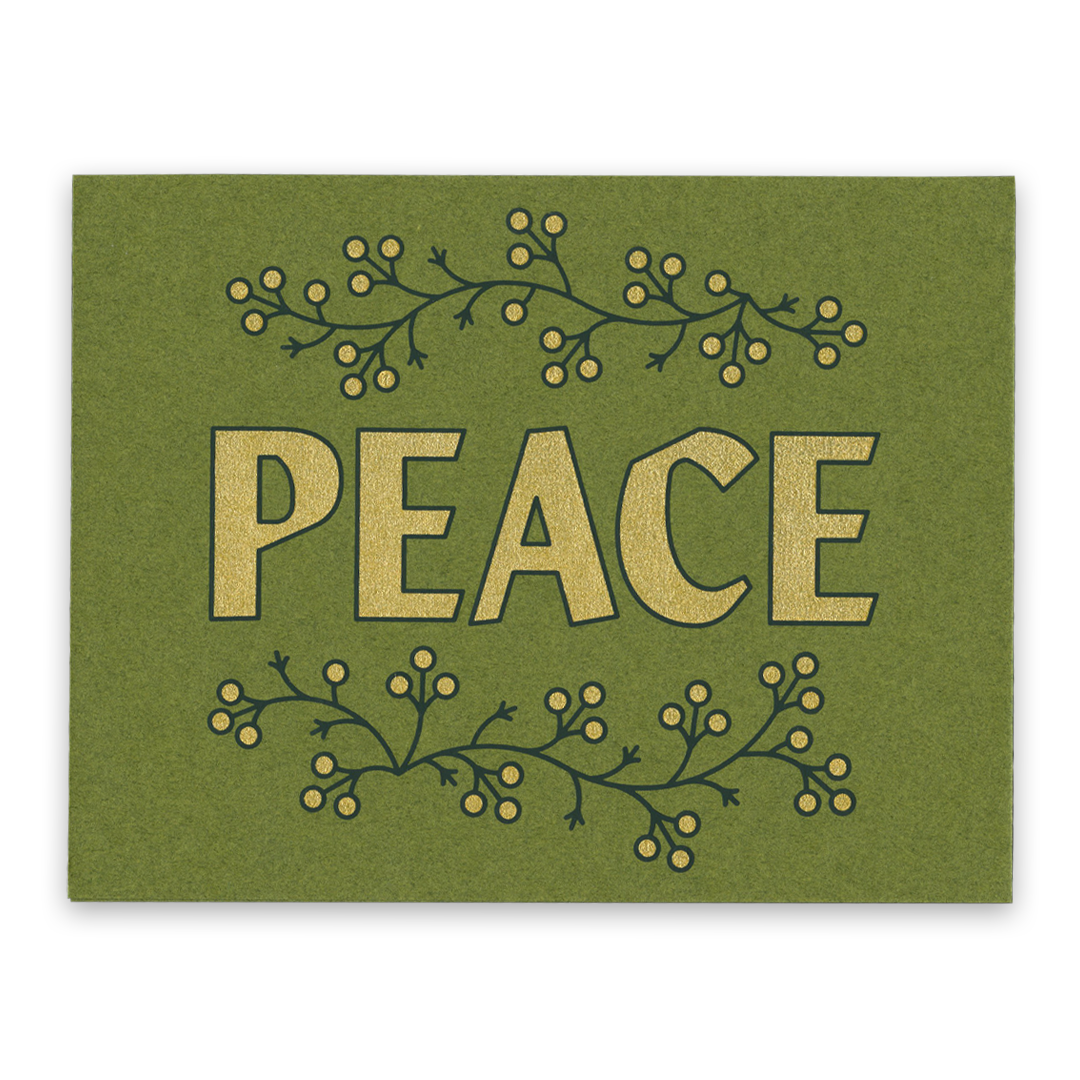
Screen printed gold and dark green ink holiday card, French paper
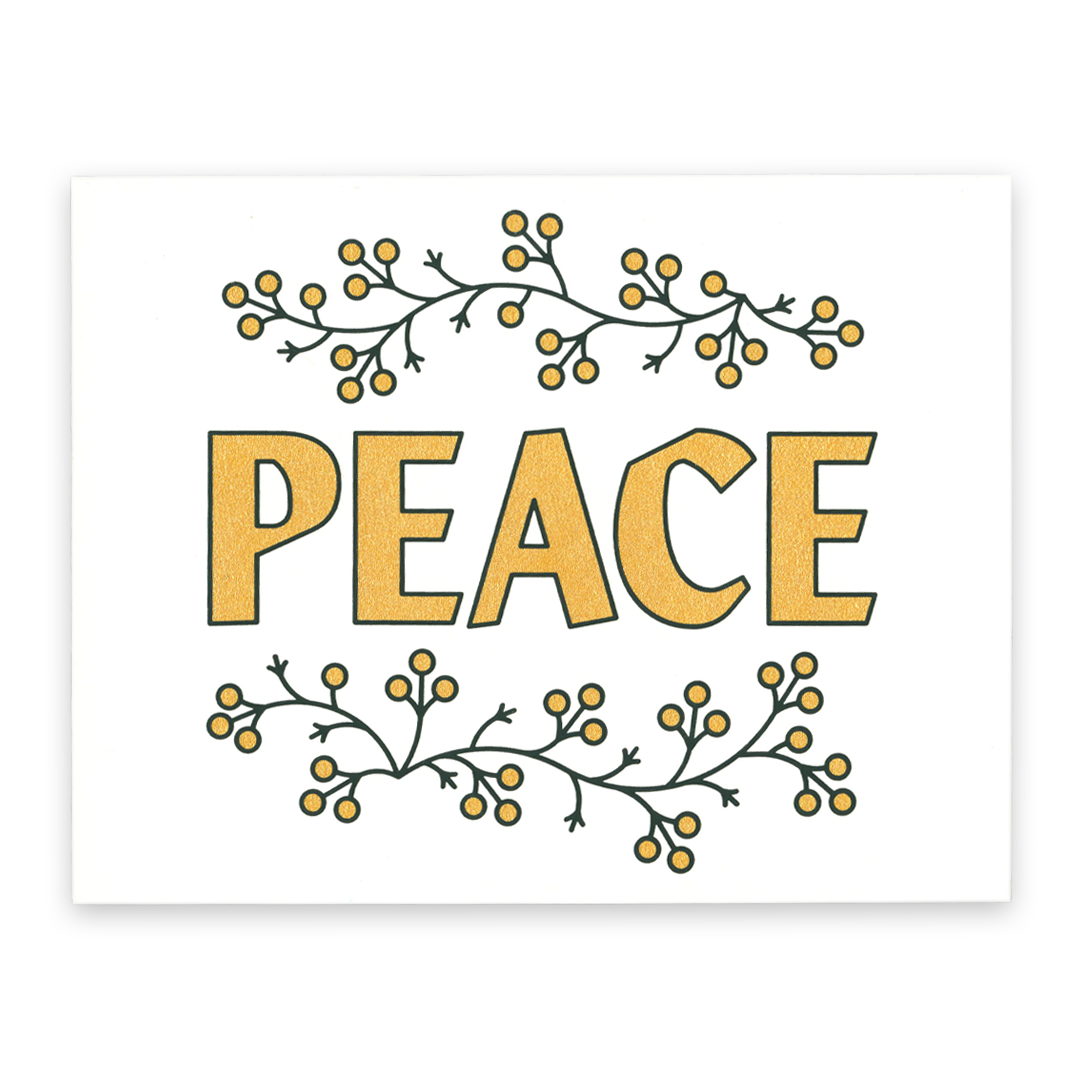
Screen printed gold and dark green ink holiday card, French paper
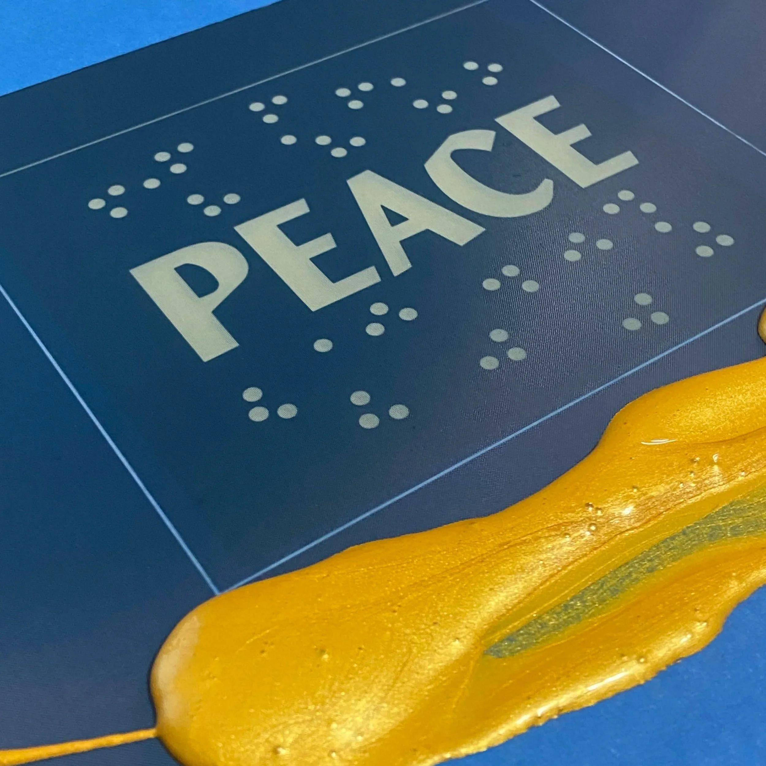
Printing process; gold ink before creating the first metallic layer
Setting up the second green layer onsite at The Victorian for live screen printing
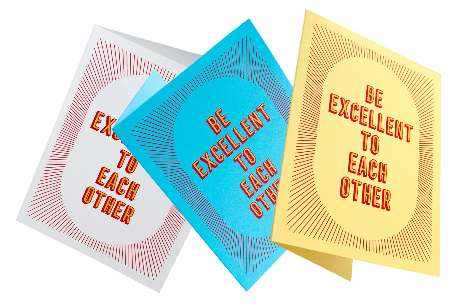
Be Excellent series: red and gold archival ink on French Pop Tones, A2 folded greeting cards

Hello series: white and green archival ink on Mohawk Renewal Hemp, A2 folded greeting cards
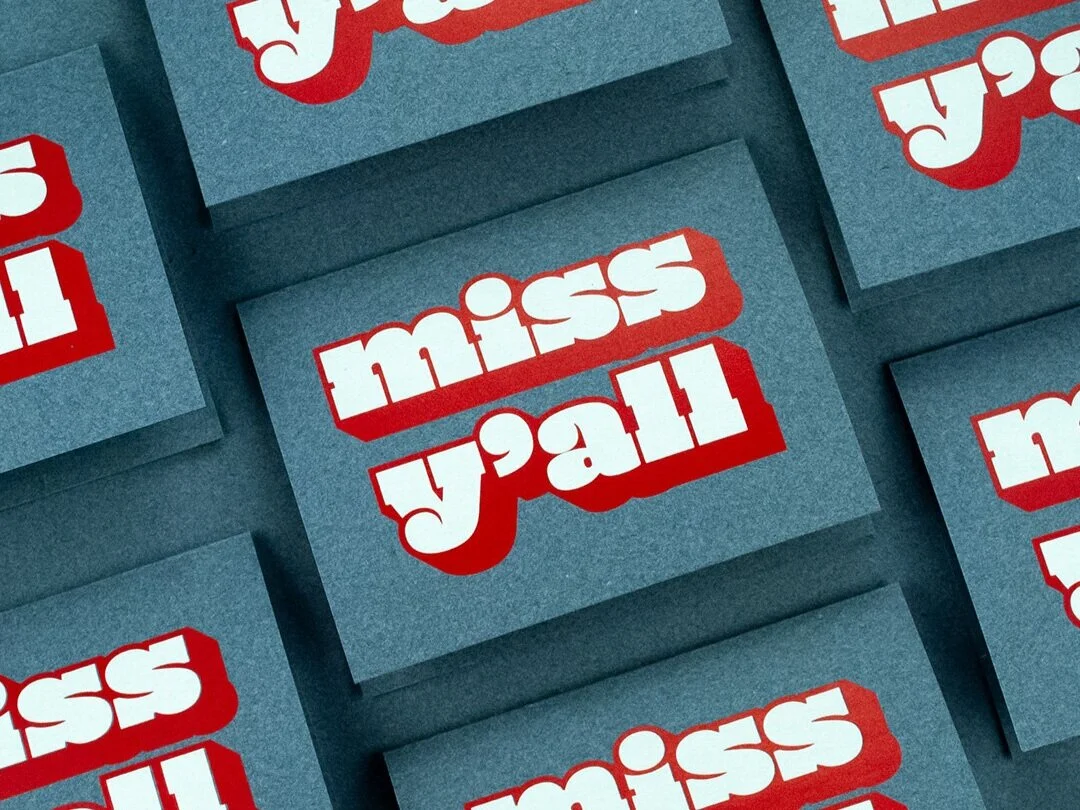
Miss Y’all series: red and white archival ink on Mohawk Renewal Denim, A2 folded greeting cards
“Even in this digital age, there is a growing appreciation for the permanence of physical objects. They remind us that we were here. It is proof that our work and our projects exist.”
— Dora Drimalas
Co-founder, Executive Creative Director, Hybrid Design
(from Curiosity in all things)