St. John Provisions
rebrand + design—2015
St. John Provisions, a boutique vacation delivery service, needed a new logo for their growing business. Working closely with the owner, a fresh color palette was created along with a flexible logo that allowed for multi-color applications across various media. The combination of watercolor patterns and the various typefaces and icons helped showcase the diverse flavor of the Virgin Islands, while communicating the main offering of the brand.
The first step was to update the inherited brand logo system to a more lively and colorful tone of voice
The original service was built on a pre-existing web platform which required some tactical tweaks for updating the look and feel.
previous logo

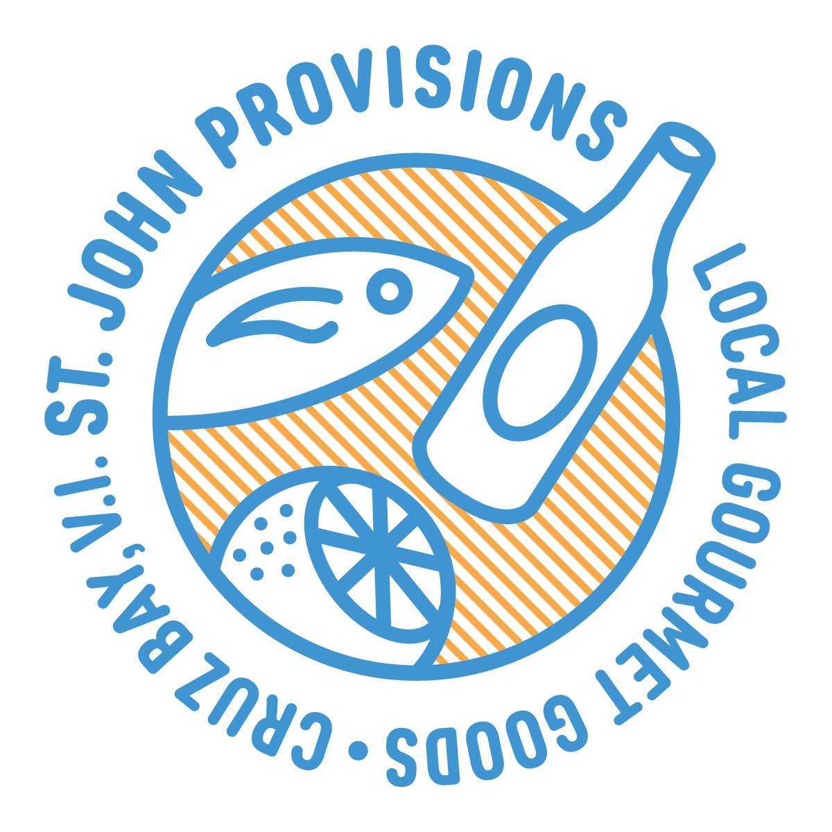
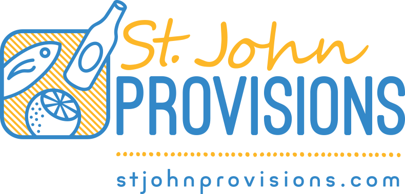
updated logo

redesign goals
Recreating the main logo involved maintaining working elements of the previous design but with more practical layout considerations and a color palette that reflected the vacation spot that is the U.S.V.I.
strategic visual update
The main goal of the colors and type/icons was to convey a modern and lively approach to vacation goods delivery, keeping things organic with watercolors and hand-drawn type but maintaining a clean presentation.

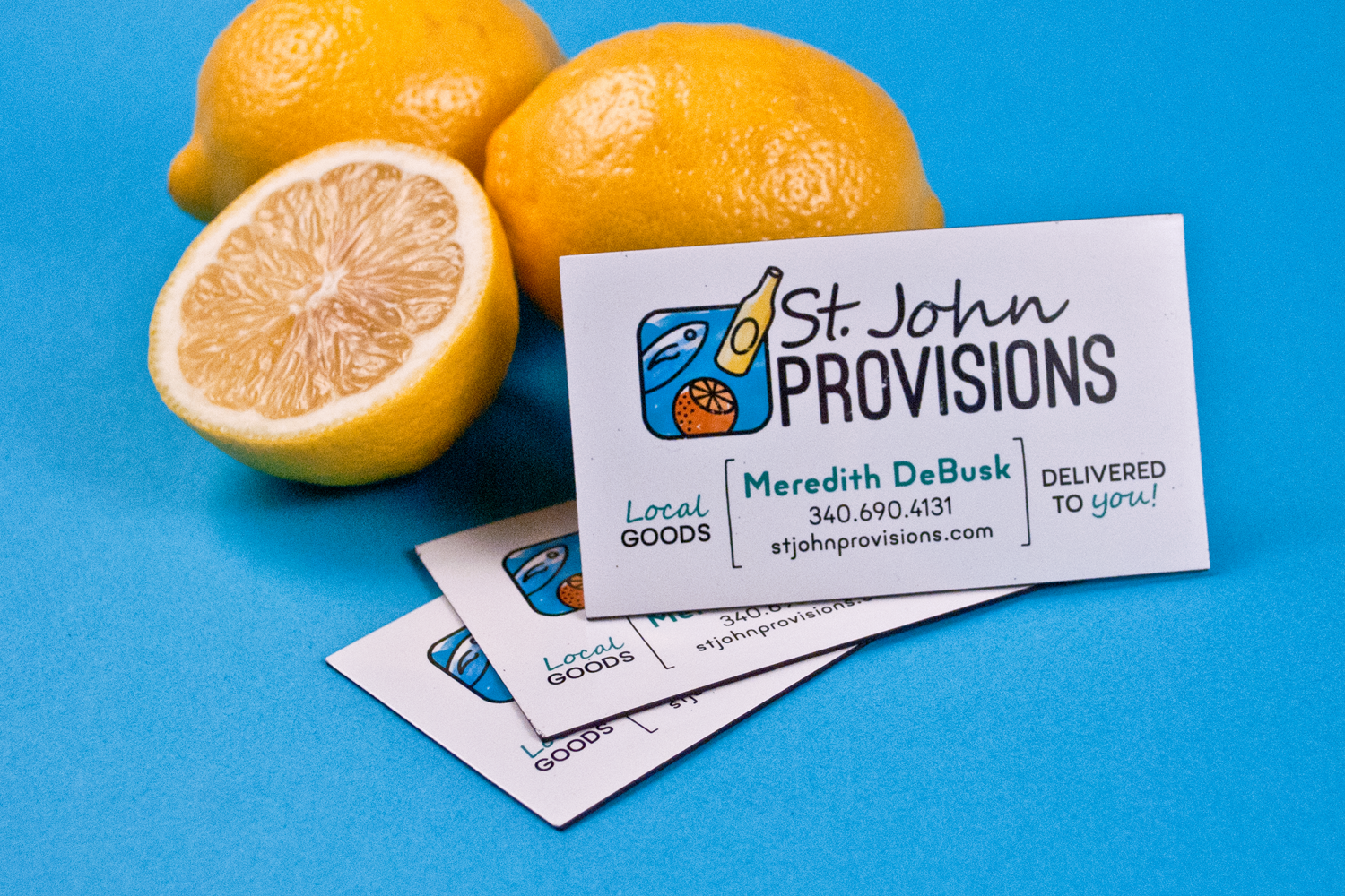
Magnet for coolers and refrigerators for easy contact info for refills
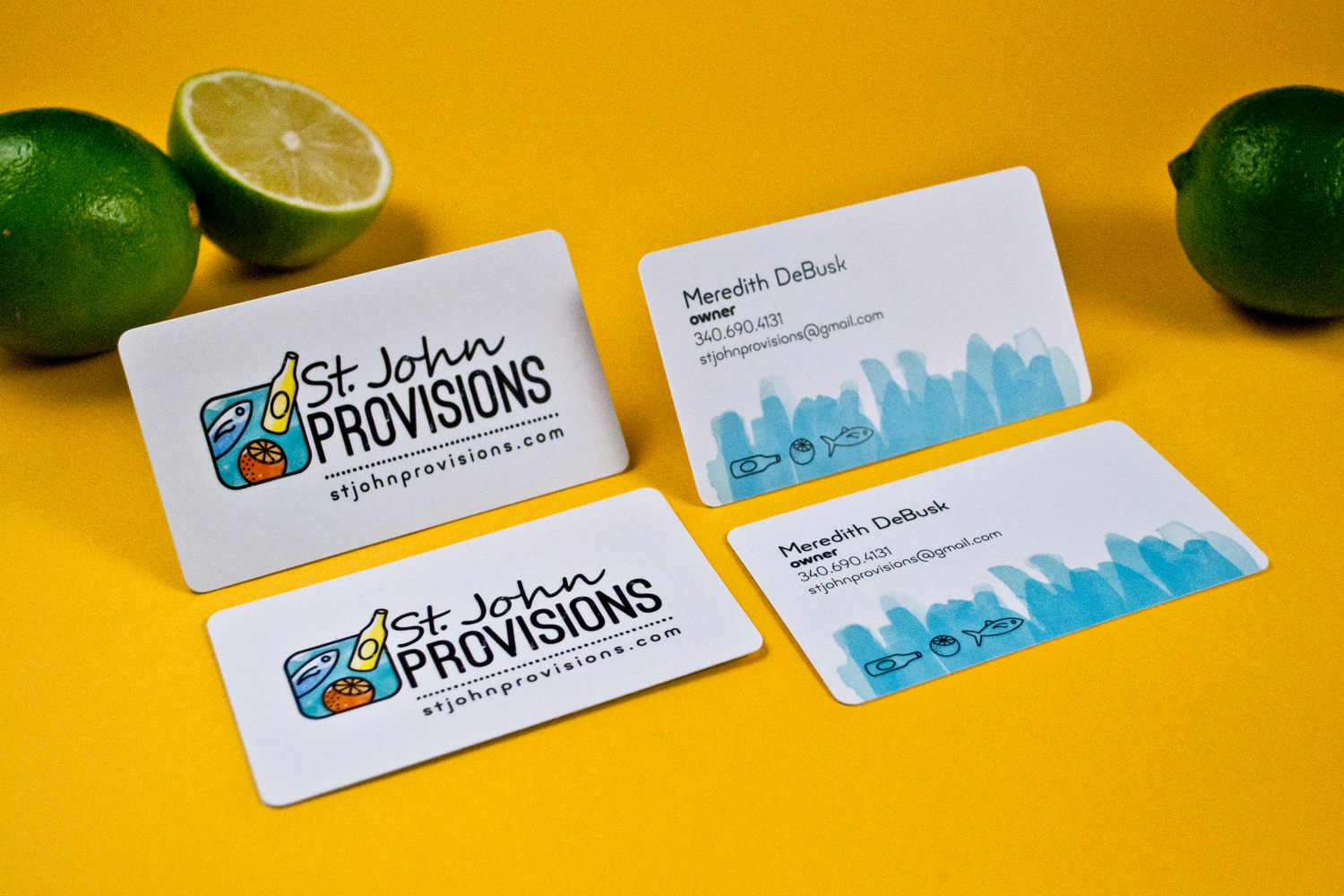
Business cards utilizing full-color logo and watercolor treatment
Multiple versions of the logo were created both in full-color and in 2-color for stickers and labels. The core blue and gold palette helped keep things fresh and bright.
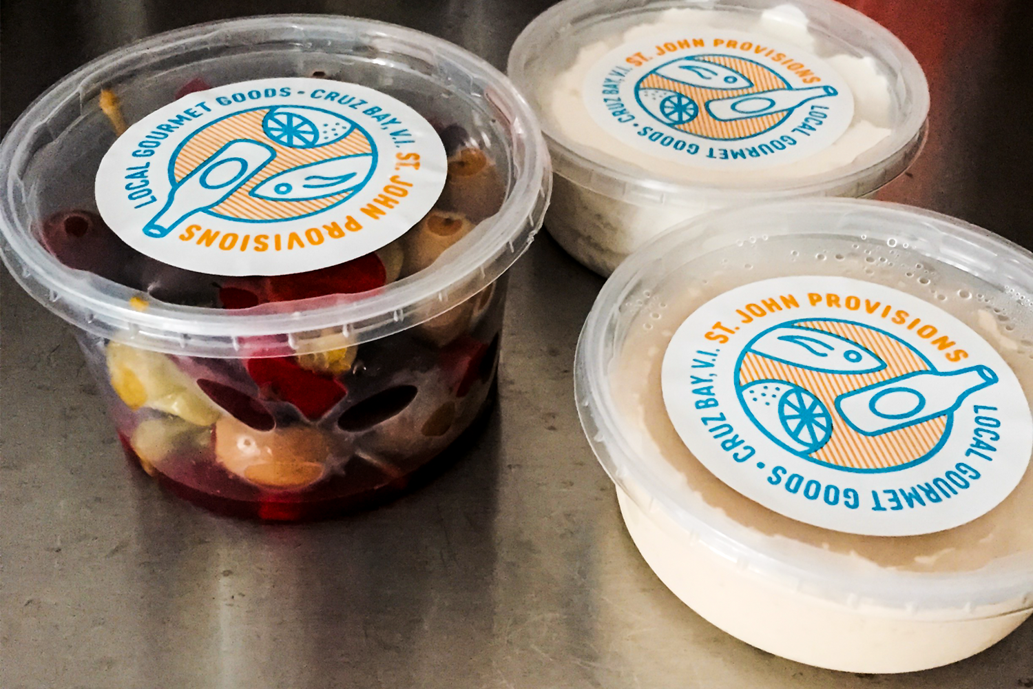
Onsite stickers showing circular logo adaptation for round labels