Austin Coding Academy
Branding + logo design
2014 – present
Created as a resource for students and professionals alike, the Austin Coding Academy (ACA) aims to give users the skills and knowledge to interact with the coding world.
Thanks to surging enrollment and growth opportunities, the Academy required both a brand refresh and a flexible identity system that allowed for the inclusion of new cities under the Austin Coding Academy name.
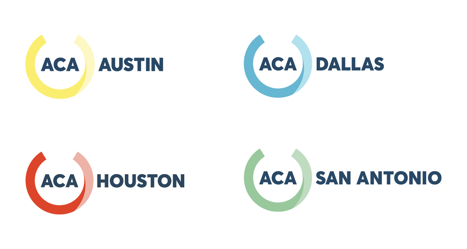
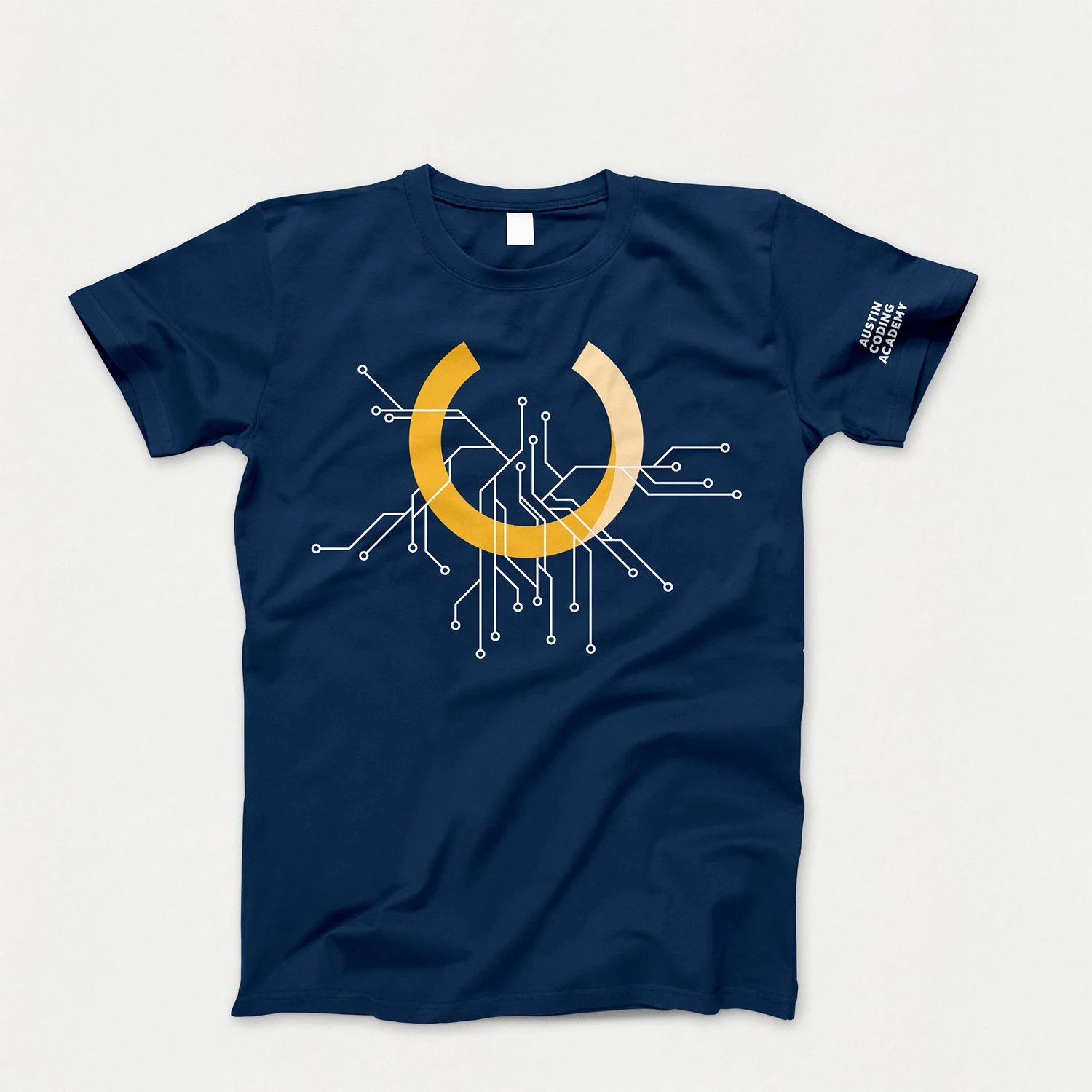
The new system uses the ACA acronym housed in a partial circle element, nodding to the old logo. The original color scheme was tweaked to allow for the addition of new campus-specific hues that work with the standard blue and gold palette.
ACA is currently operating in San Antonio, Houston and Dallas, TX with plans for growth into more cities in the future.

After having previously handled an early iteration of the brand, the decision was made to simplify and build on the strengths of what we had created in prior applications.
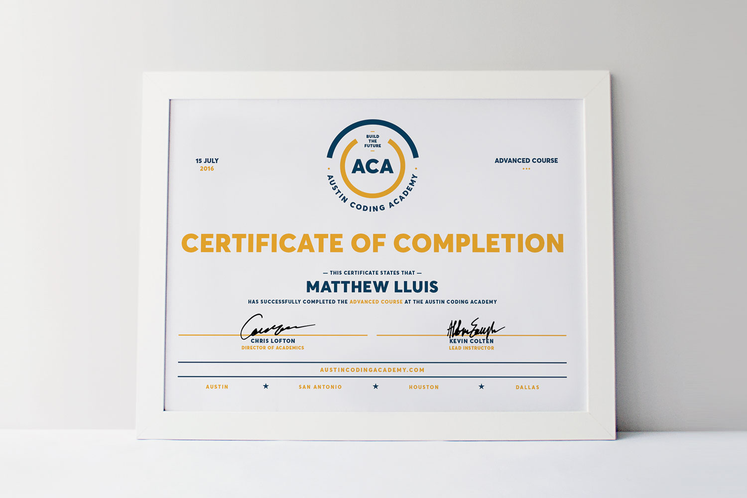
The use of dark blue as a primary color highlighted with gold maintained a scholastic tone, around which a system of secondary colors were created to complement the core color. Type was restrained to a single family with lots of flexibility in terms of weight and legibility so materials could stay consistent but modern.
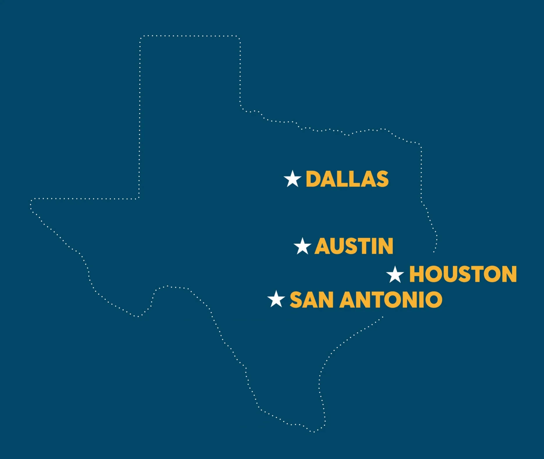

City expansions
Color architecture
As the team moved into new cities, additional colors and type lockups were added to help organize content on the website and social media.
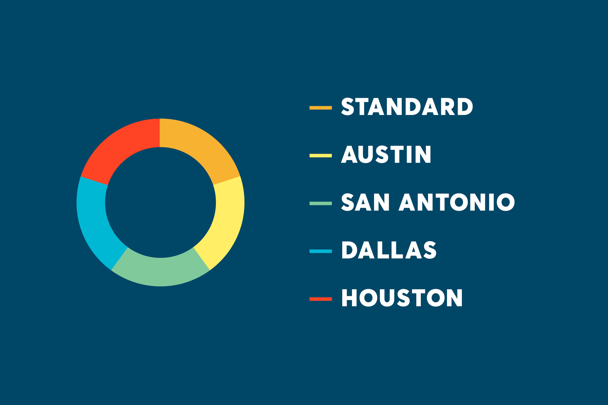
Color theory
Colors were balanced to allow them to work on both dark and light backgrounds, specifically the core dark blue and white.
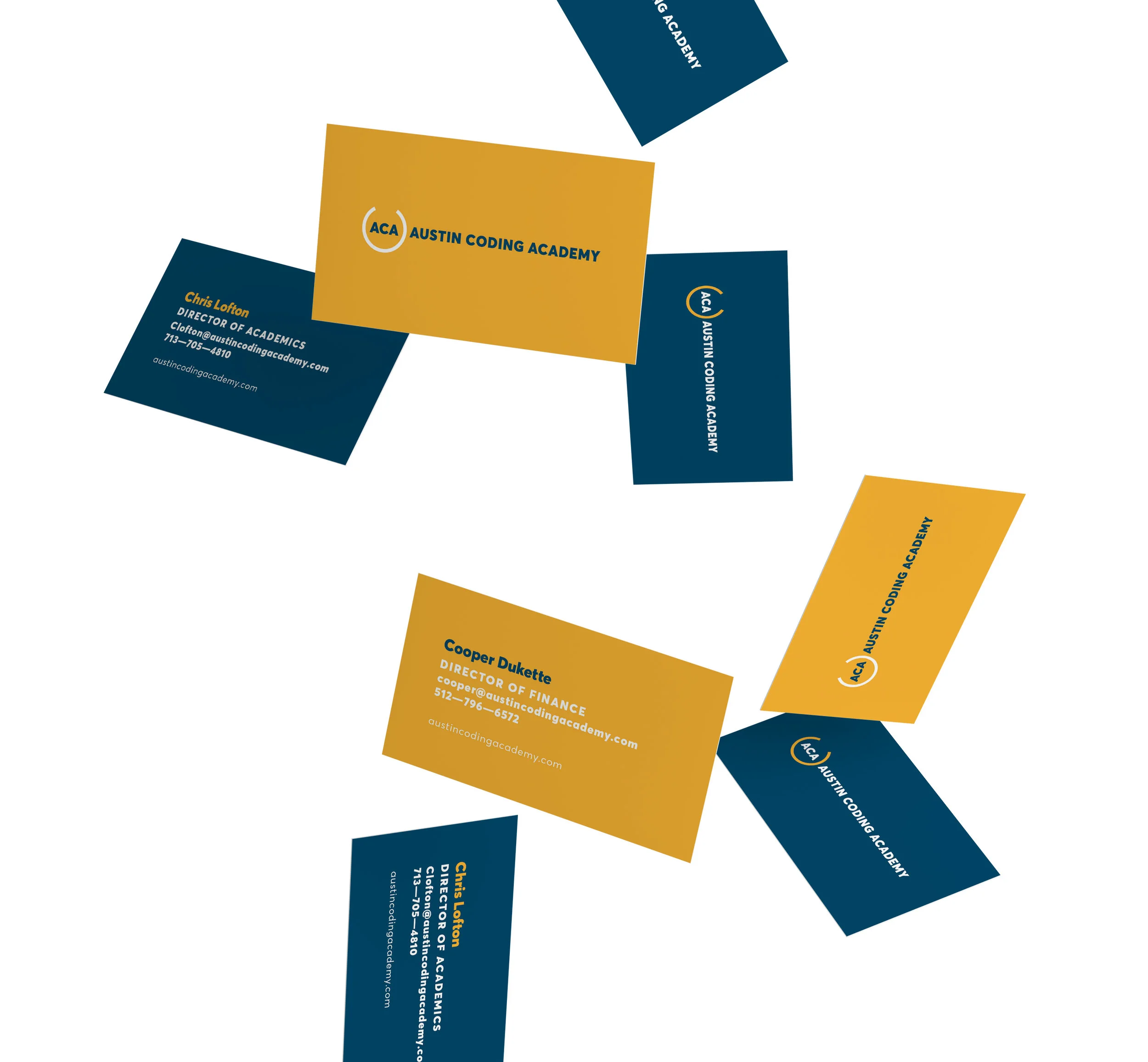
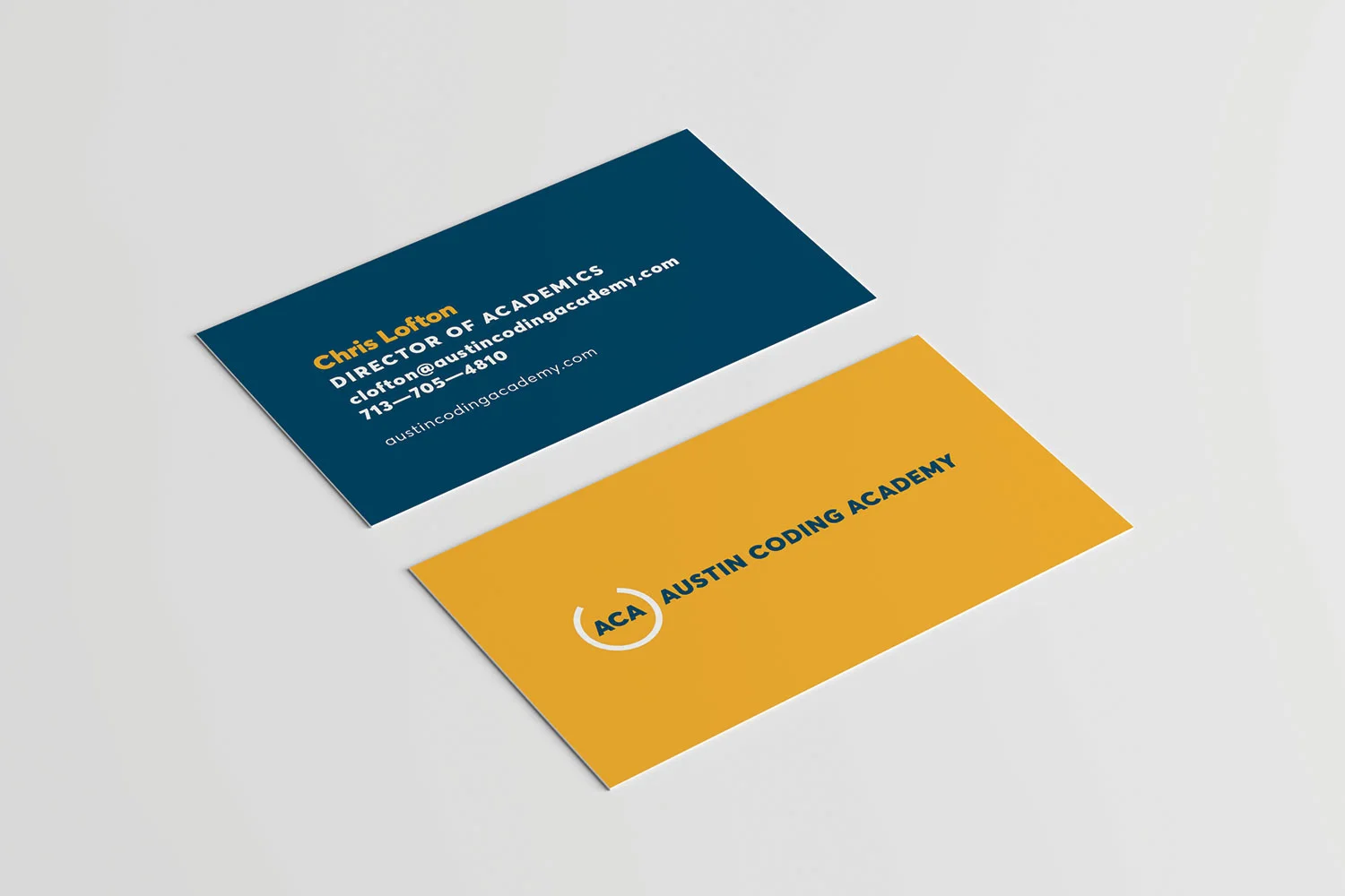
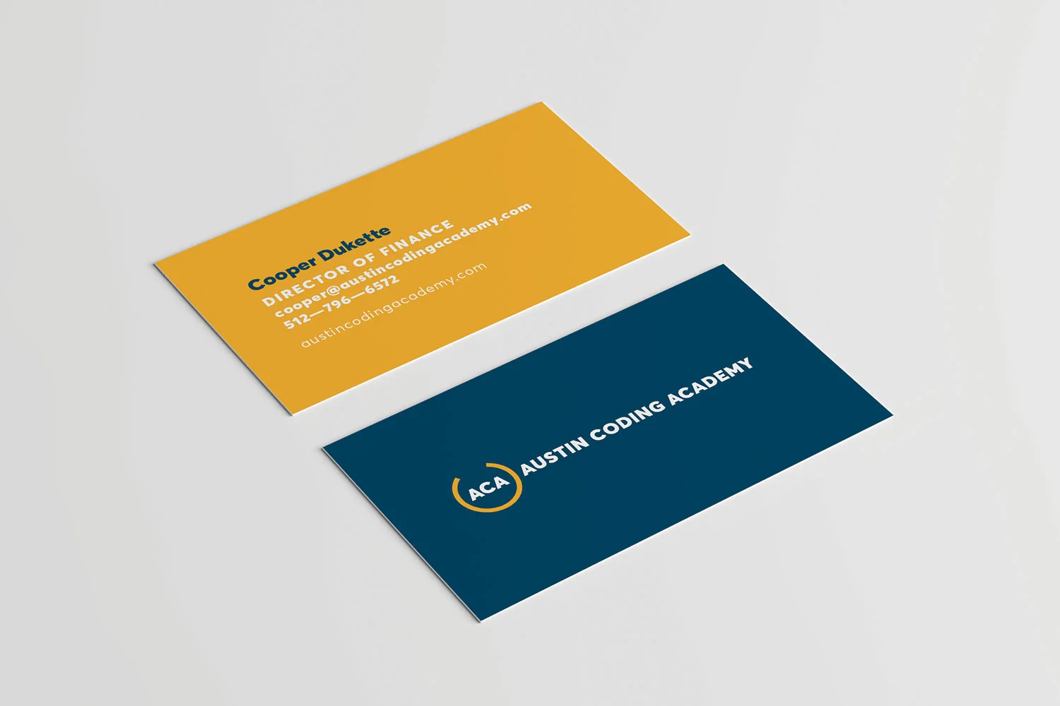
Business cards
Each campus was provided with two separate colorways, allowing individuals a choice when designing their company cards.
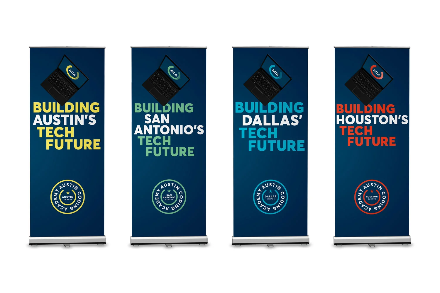
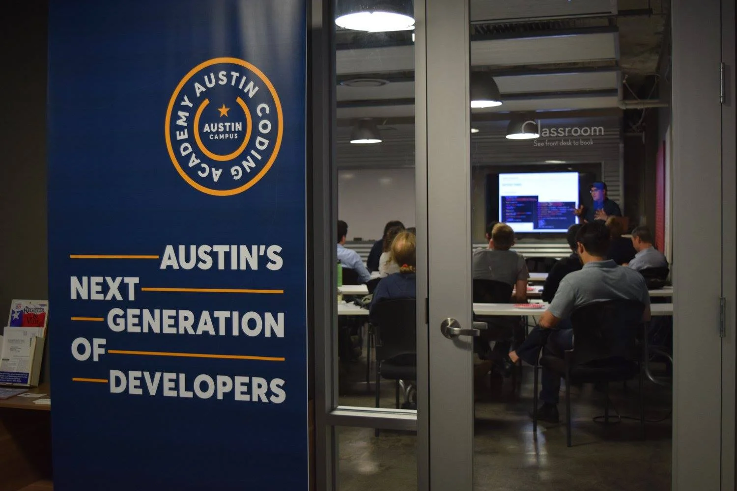
Standing banners
Having to brand workspaces for night classes and special events required a series of pop-up banners. The above artwork was later expanded into additional designs and updated crests for stickers (below).
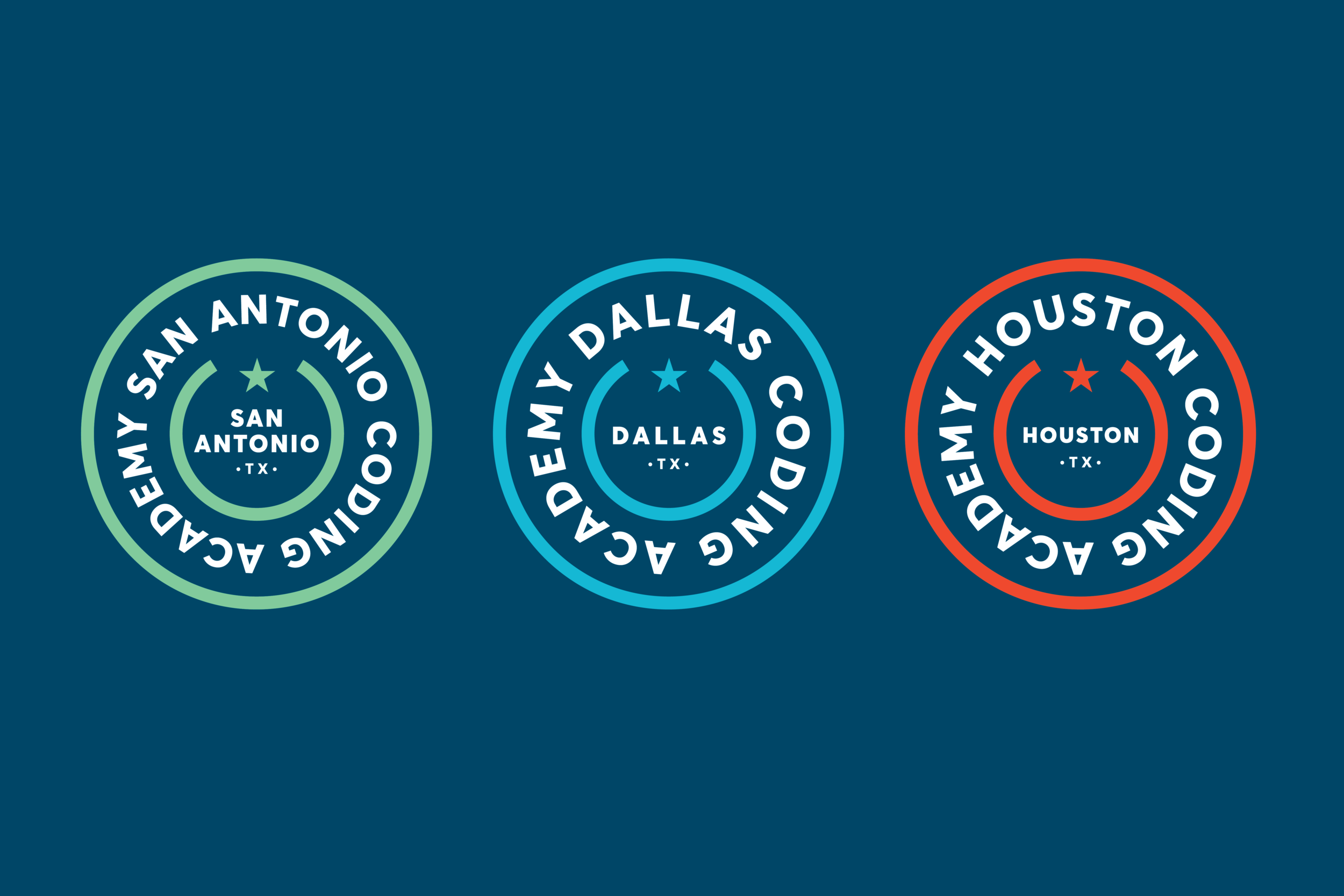
Crests
Secondary crests were created for each campus and used for circular stickers in addition to banner application.
Typography
The type family Averta was selected thanks to friendly startup licensing and a robust family of available weights and alternates. Using a single family kept visual materials consistent and allowed more focus on color exploration and composition for various uses.